Matplotlib DataV Std.
大约 19 分钟
Matplotlib DataV Std.
作者:韩佳明Hirsun
统一框架
medals = pd.read_csv('medals_by_country_2016.csv', index_col=0)

import matplotlib.pyplot as plt

# 第一张图

#拆包
fig, ax = plt.subplots()

ax.set_xlabel("Time (months)")
ax.set_ylabel("Average temperature (Fahrenheit degrees)")
ax.set_title("Weather in Seattle")

plt.show()

fig.set_size_inches([5, 3]) # x 和 y
fig.savefig("gold_medals.png", dpi=300)

# Clear the distplot
plt.clf()

# 第二张图
fig, ax = plt.subplots()
ax.set(xlabel="Tuition 2013-14", ylabel="Distribution", xlim=(0, 50000), title="2013-14 Tuition and Fees Distribution")
plt.show()

fig.savefig("gold_medals.svg")
Gallery
Plot
点图 或者 线图(由点连成线)
- 给定DFx,DFy,将DFx对应的DFy的值呈现出来
- DFx最好是唯一的,不会出现一个相同的x对应两个y
- index有序,DFx呈现会自动排序
- 适用于描述变化趋势(类似函数)
线图
#ax.plot(DFx,DFy) 每一次画一条线
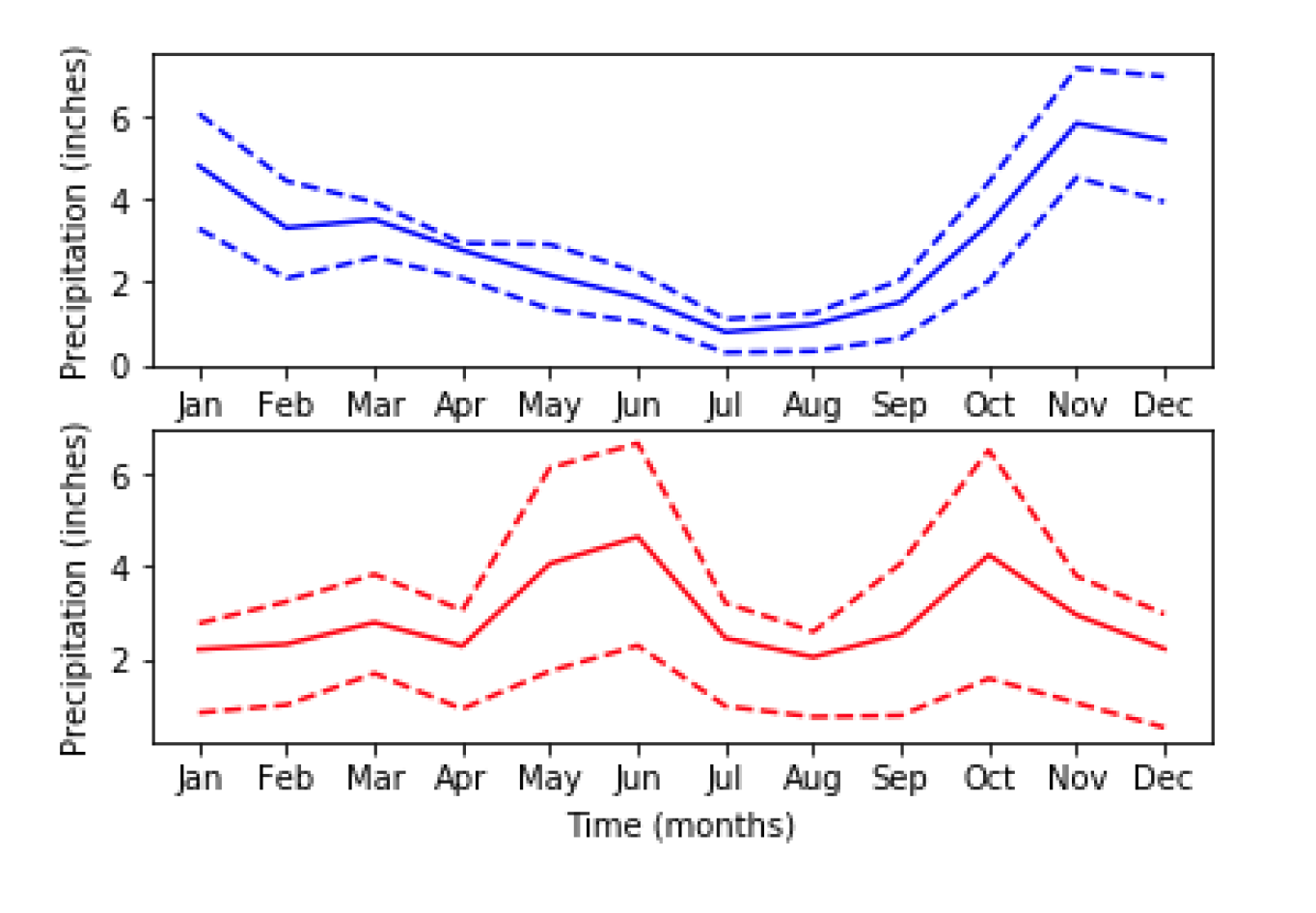
ax.plot(seattle_weather["MONTH"], seattle_weather["MLY-TAVG-NORMAL"])
ax.plot(austin_weather["MONTH"], austin_weather["MLY-TAVG-NORMAL"])
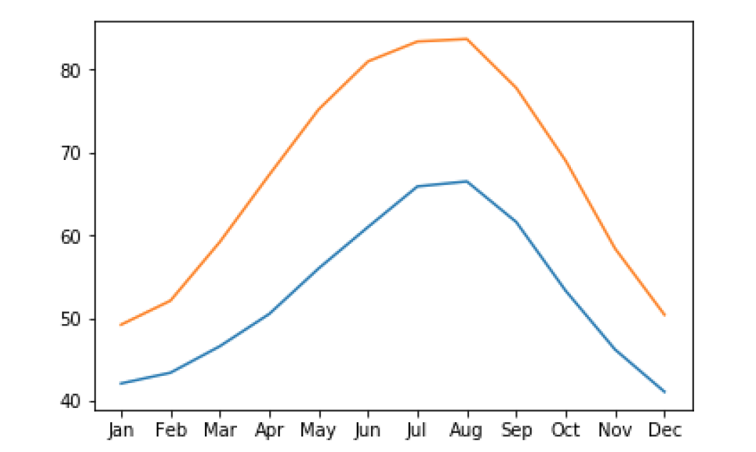
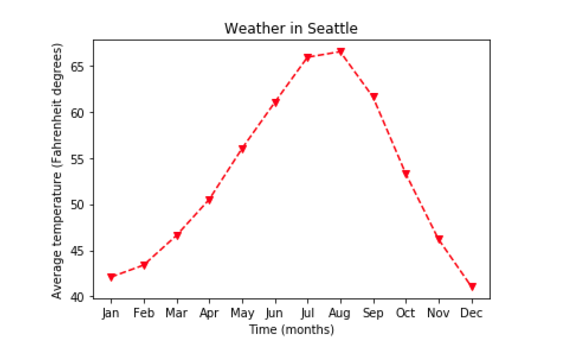
样式
ax.plot(seattle_weather["MONTH"],seattle_weather["MLY-TAVG-NORMAL"],marker="v", linestyle="--", color="r")
plt.subplots
fig, ax = plt.subplots(3, 2) #先y后x
ax[0, 0].plot(seattle_weather["MONTH"],seattle_weather["MLY-PRCP-NORMAL"],color='b')
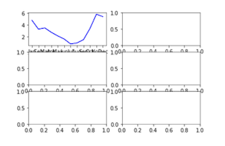
fig, ax = plt.subplots(2, 1, sharey=True) #统一y轴
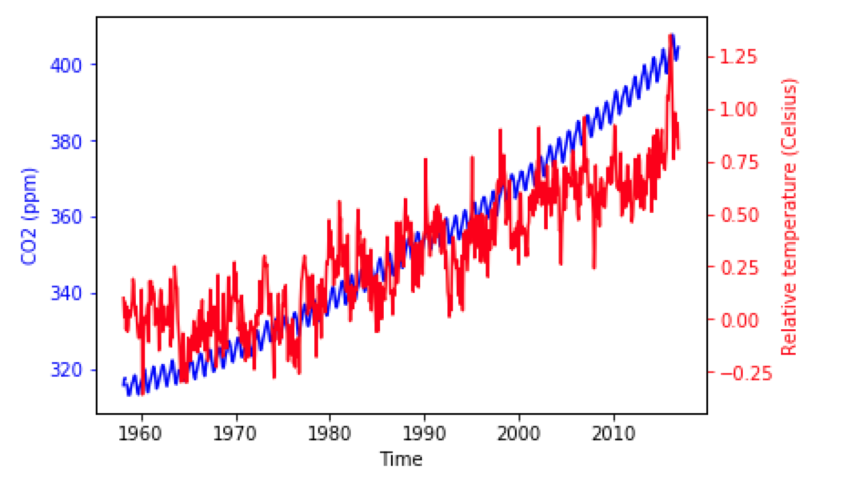
twin axes
fig, ax = plt.subplots()

ax.plot(climate_change.index, climate_change["co2"],color='blue')
ax.set_xlabel('Time')
ax.set_ylabel('CO2 (ppm)', color='blue')
ax.tick_params('y', colors='blue')

ax2 = ax.twinx()
ax2.plot(climate_change.index,climate_change["relative_temp"],color='red')
ax2.set_ylabel('Relative temperature (Celsius)',color='red')
ax2.tick_params('y', colors='red')

plt.show()
Annotation
ax2.annotate(">1 degree",
xy=(pd.Timestamp('2015-10-06'), 1),  # 目标点的位置
	xytext=(pd.Timestamp('2008-10-06'), -0.2),    # 指定文本的位置
	arrowprops={"arrowstyle":"->", "color":"gray"})  # 样式
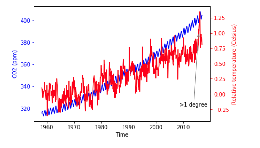
建议后期用photoshop处理...
Bar
不计算,直接录入
- 适合不可衡量的量,无序x 轴(苹果香蕉梨)
DF bar
给定一个x列,展现x对应的y的值。
- 统计的值必须是数值或者时间(连续的值)
- 指定x,x是存放种类的列,采用的列的值的种类是有限的(苹果香蕉梨),且是唯一的,不重复的
- 每个种类的对应的y值将呈现(y)
- 适用于值的种类有限
# 拆包
fig, ax = plt.subplots
# 一次画一层,画多次 ax.bar(DFx,DFy,yerr = DF)
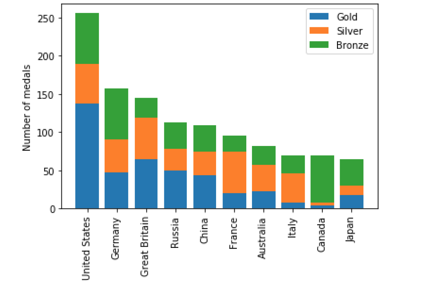
fig, ax = plt.subplots ax.bar(medals.index, medals["Gold"], label="Gold")
ax.bar(medals.index, medals["Silver"], bottom=medals["Gold"], label="Silver")
ax.bar(medals.index, medals["Bronze"], bottom=medals["Gold"] + medals["Silver"], label="Bronze")
#设置 x 轴名称,旋转90度
ax.set_xticklabels(medals.index, rotation=90)
#设置 y 轴标签
ax.set_ylabel("Number of medals")
# 显示图例
ax.legend()
plt.show()
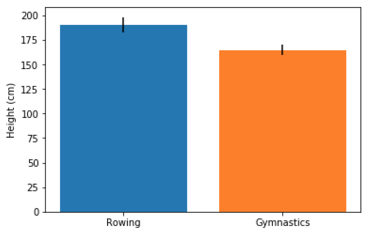
单一Bar
- 手动录入标签和数字(值),一次录入画一个竖
fig, ax = plt.subplots()

# 一次画一个竖 ax.bar("x_name",num,yerr = num2)
ax.bar("Rowing",mens_rowing["Height"].mean(),yerr=mens_rowing["Height"].std())
ax.bar("Gymnastics",mens_gymnastics["Height"].mean(),yerr=mens_gymnastics["Height"].std())

ax.set_ylabel("Height (cm)")
plt.show()
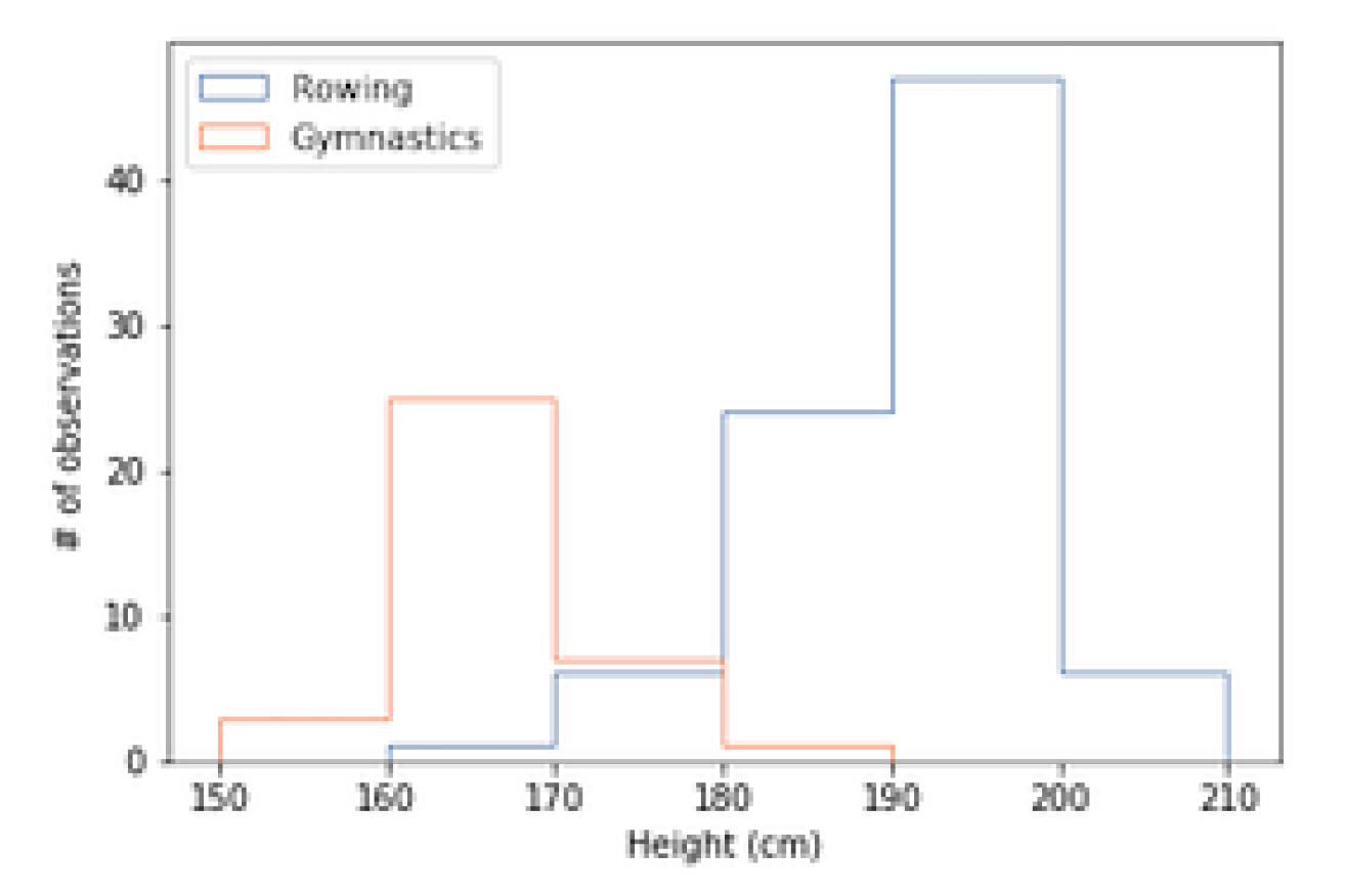
Hist
- 适用于画出某一列区间分布
- 比如某一列是温度,图表将温度自动分好区间,并统计个数,将每个区间的个数呈现在y上
- 统计的值必须是数值或者时间(连续的值)
# 一个数据源画一个堆,可以画多次 ax.hist(DF)
ax.hist(mens_rowing["Height"], label="Rowing",bins=[150, 160, 170, 180, 190, 200, 210],histtype="step")
ax.hist(mens_gymnastic["Height"], label="Gymnastics",bins=[150, 160, 170, 180, 190, 200, 210],histtype="step")

ax.set_xlabel("Height (cm)")
ax.set_ylabel("# of observations")

ax.legend()
plt.show()
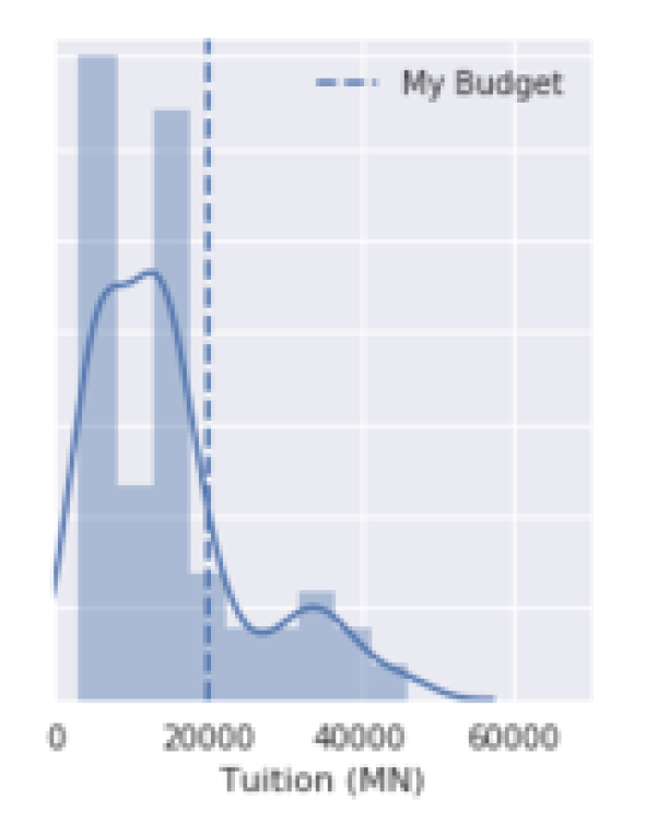
Axvline
ax1.axvline(x=20000, label='My Budget', linestyle='--')
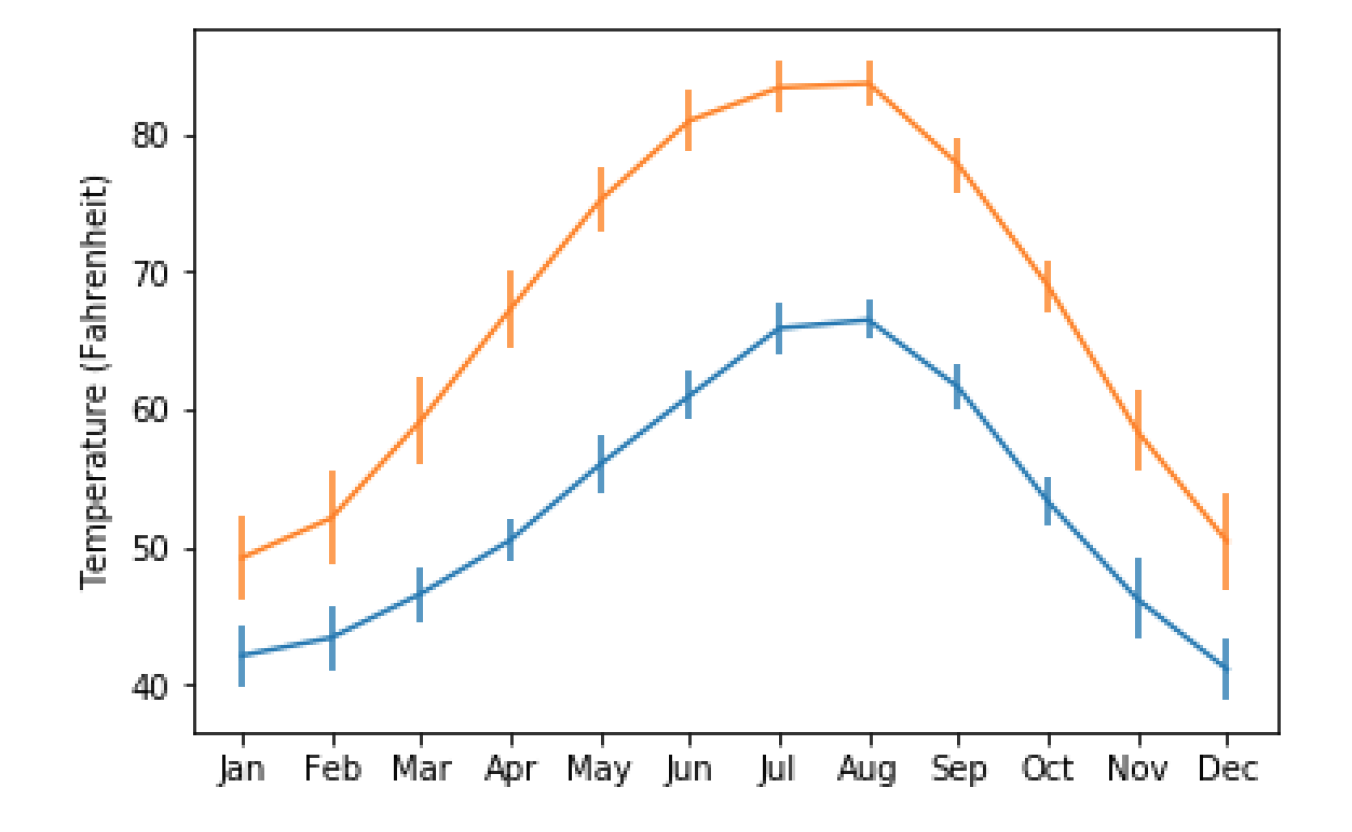
Error bars
- 给定DFx,DFy,将DFx对应的DFy的值呈现出来
- DFx最好是唯一的,不会出现一个相同的x对应两个y
- index有序,DFx呈现会自动排序
- 适用于描述变化趋势(类似函数)
- 统计的值必须是数值或者时间(连续的值)
fig, ax = plt.subplots()

#一次画一条线 ax.errorbar(DFx,DFy,yerr = DF)
#提前把yerr算出来,放到一列里面
ax.errorbar(seattle_weather["MONTH"],seattle_weather["MLY-TAVG-NORMAL"],yerr=seattle_weather["MLY-TAVG-STDDEV"])
ax.errorbar(austin_weather["MONTH"],austin_weather["MLY-TAVG-NORMAL"],yerr=austin_weather["MLY-TAVG-STDDEV"])

ax.set_ylabel("Temperature (Fahrenheit)")
plt.show()
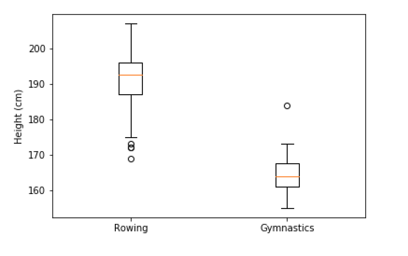
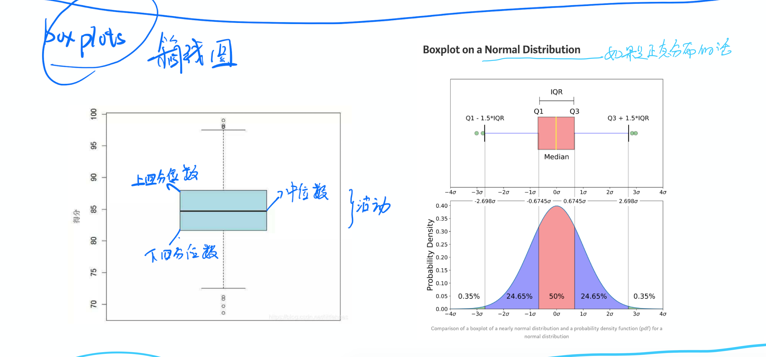
Boxplots
- 给定一个或者多个指定列
- 每一列的值的特征将呈现在图上(y轴)
- 统计的值必须是数值或者时间(连续的值)
- 用于表示大量相对无规律值的分布特点
实例:评价不同水果的产量
fig, ax = plt.subplots()

#只画一次 ax.boxplot([DF1,DF2]) 一次性指定几个列
ax.boxplot([mens_rowing["Height"],mens_gymnastics["Height"]])

ax.set_xticklabels(["Rowing", "Gymnastics"])
ax.set_ylabel("Height (cm)")

plt.show()
怎么看
Scatter
- 给定DFx,DFy,将DFx对应的DFy的值呈现出来
- 一个x和一个y确定一个点或者多个点
- index有序,DFx呈现会自动排序
- 统计的值必须是数值或者时间(连续的值)
- 用于表示大量相对无规律值的分布特点
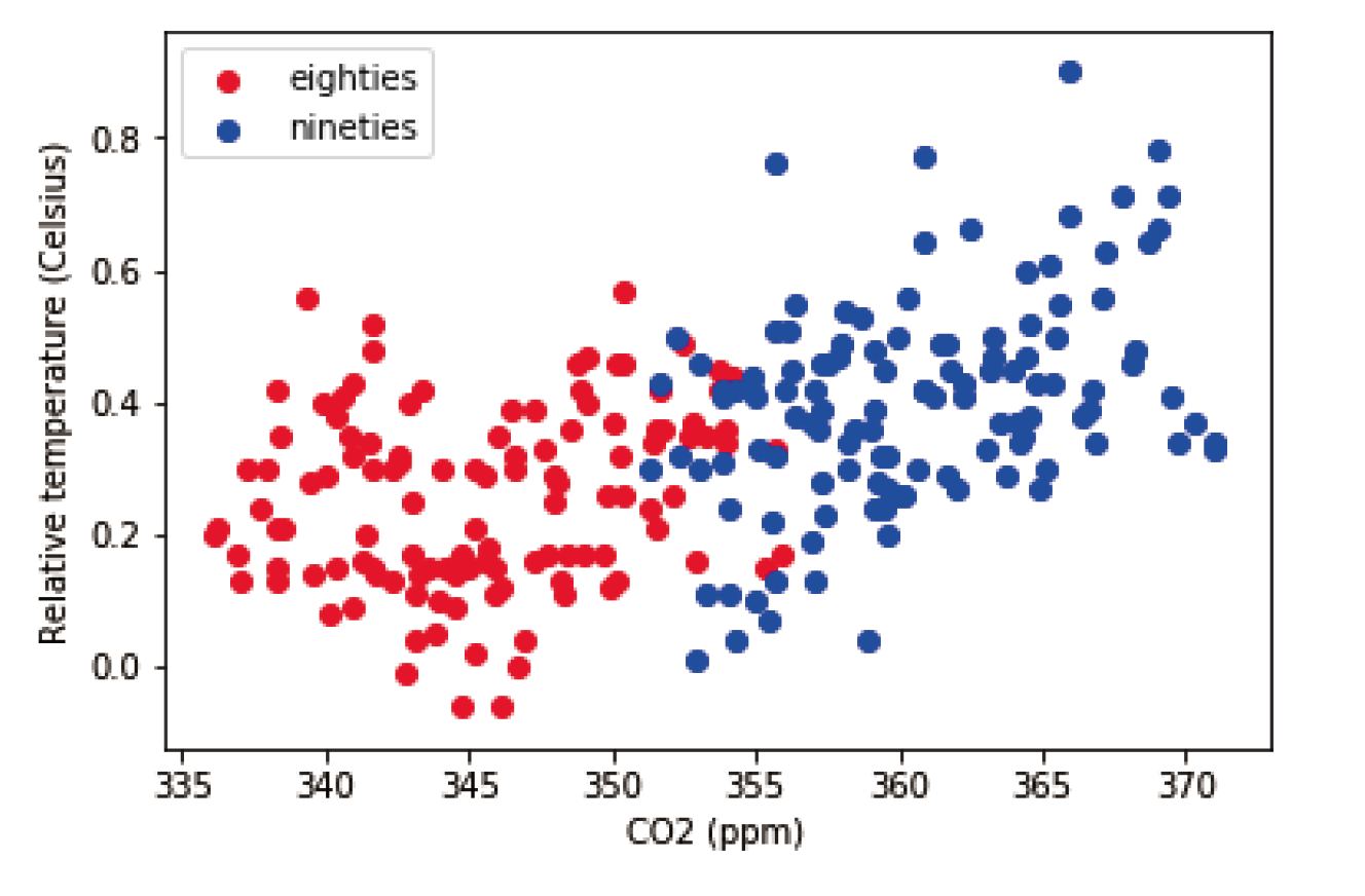
eighties = climate_change["1980-01-01":"1989-12-31"]
nineties = climate_change["1990-01-01":"1999-12-31"]

fig, ax = plt.subplots()

#一次点一个集群,可以画多个集群 ax.scatter(DFx,DFy)
ax.scatter(eighties["co2"], eighties["relative_temp"],color="red", label="eighties")
ax.scatter(nineties["co2"], nineties["relative_temp"],color="blue", label="nineties")

ax.legend()
ax.set_xlabel("CO2 (ppm)")
ax.set_ylabel("Relative temperature (Celsius)")

plt.show()
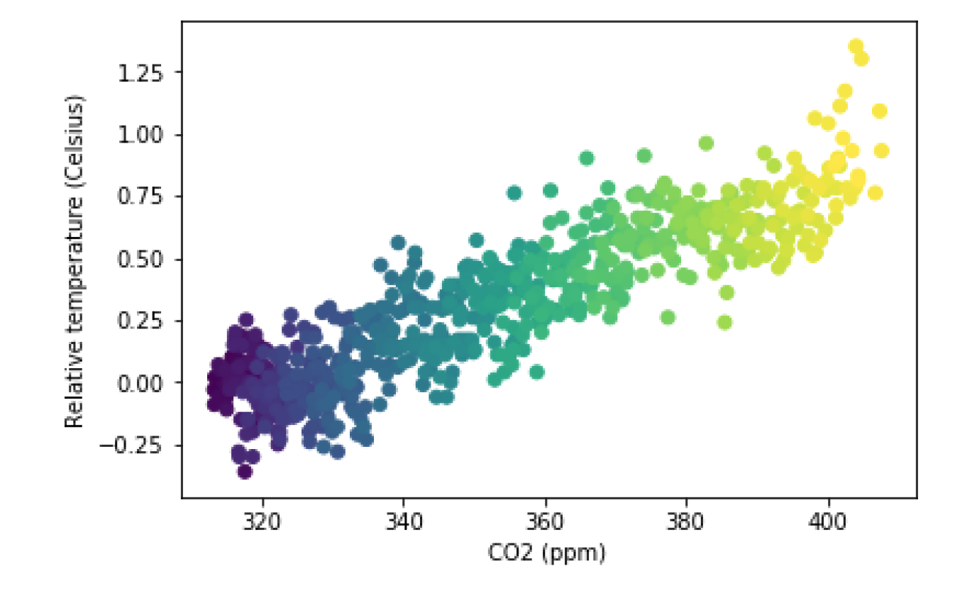
fig, ax = plt.subplots()

ax.scatter(climate_change["co2"], climate_change["relative_temp"],c=climate_change.index)

ax.set_xlabel("CO2 (ppm)")
ax.set_ylabel("Relative temperature (Celsius)")

plt.show()
拆分画图
绘制图像的步骤应该为
- 拆分 figure 和 ax
- 画第一层
- 画第二层
- ......
- plt.show()
参考以下案例
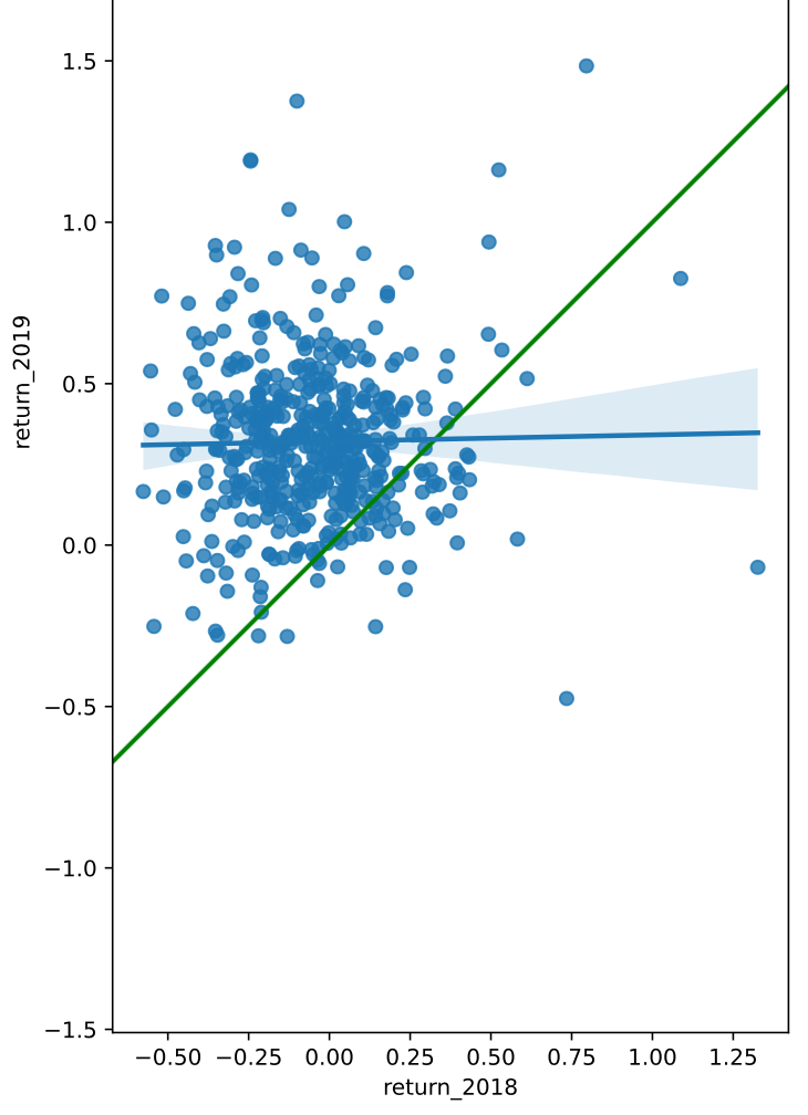
# Create a new figure, fig
fig, ax = plt.subplots()

# Plot the first layer: y = x
plt.axline(xy1=(0,0), slope=1, linewidth=2, color="green")

# Add scatter plot with linear regression trend line
sns.regplot(x = "return_2018", y = "return_2019", data = sp500_yearly_returns)

# Set the axes so that the distances along the x and y axes look the same
plt.axis("equal")

# Show the plot
plt.show()
其他简单用法
需要注意的是,前两个直接写入即可,不可用x = *** 或者 y = *** 或者 data = xxx
参数顺序
- x轴
- y轴
plt.xxx
plt.plot()
这是以上画图的简单用法,不拆包,从plt调用方法,而不是从ax调用方法
plt.plot() 和 df.plot() 不一样
- plt.plot() 和 ax.plot() 相似,常用的有 点图和线图
- 点图: 忽略 纵轴series 后面的第一参数
- 线图:纵轴series 后面的第一参数为 "o"
- df.plot 支持绘制各种图,使用参数 kind 指定
plt.plot() 参数模式
- plt.plot(series1, series2) : x轴 series1, y轴 series2,要求x和y的长度一样
- plt.plot(df): df有两列,第一列为x轴,第二列为y轴
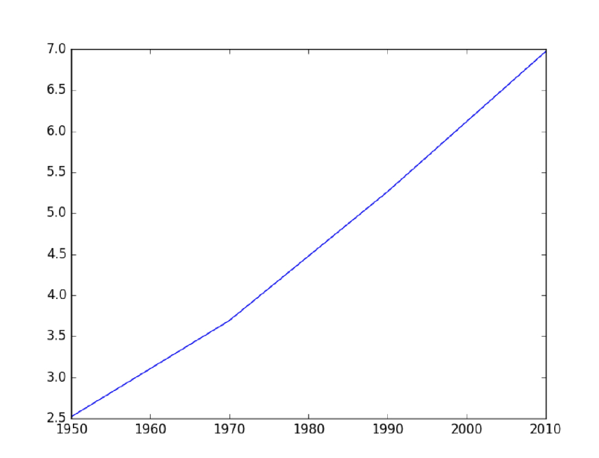
import matplotlib.pyplot as plt

year = [1950, 1970, 1990, 2010]
pop = [2.519, 3.692, 5.263, 6.972]

# 不需要用拆包subplot,直接调用plt.plot
plt.plot(year, pop)
plt.show()
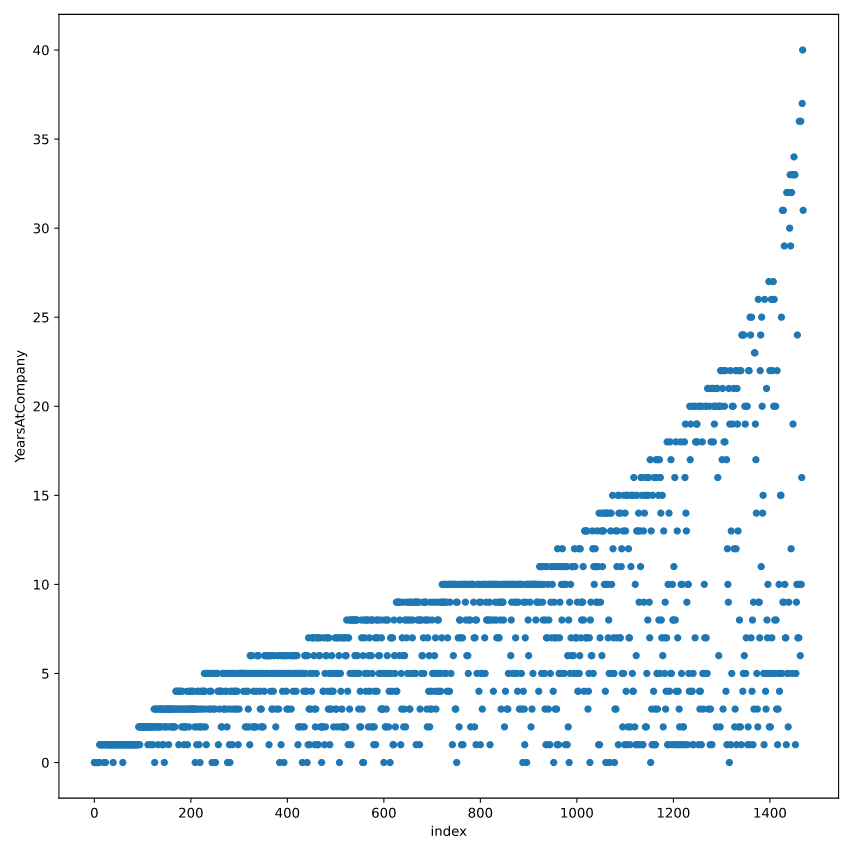
# Add an index column to attrition_pop
attrition_pop_id = attrition_pop.reset_index()

# Plot YearsAtCompany vs. index for attrition_pop_id
attrition_pop_id.plot(x= "index", y = "YearsAtCompany", kind = "scatter")
plt.show()
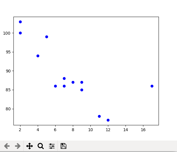
plt.scatter()
import matplotlib.pyplot as plt

x =[5, 7, 8, 7, 2, 17, 2, 9, 4, 11, 12, 9, 6]
y =[99, 86, 87, 88, 100, 86, 103, 87, 94, 78, 77, 85, 86]
plt.scatter(x, y, c ="blue")

# To show the plot
plt.show()
plt.hist()
values = [0,0.6,1.4,1.6,2.2,2.5,2.6,3.2,3.5,3.9,4.2,6]
plt.hist(values, bins=3)
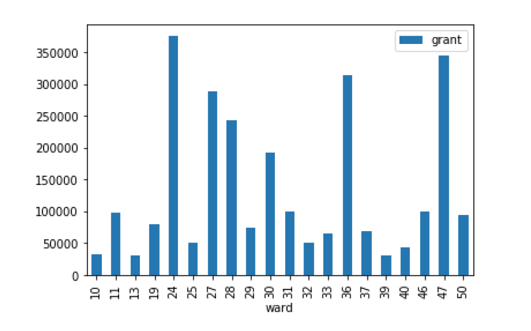
df.xxx()
df.bar()
df.plot.kde()
# 不需要用拆包subplot,直接调用从DataFrame 调用 plot
grant_licenses_ward.groupby('ward').agg('sum').plot(kind='bar', y='grant')
plt.show()
其他用法
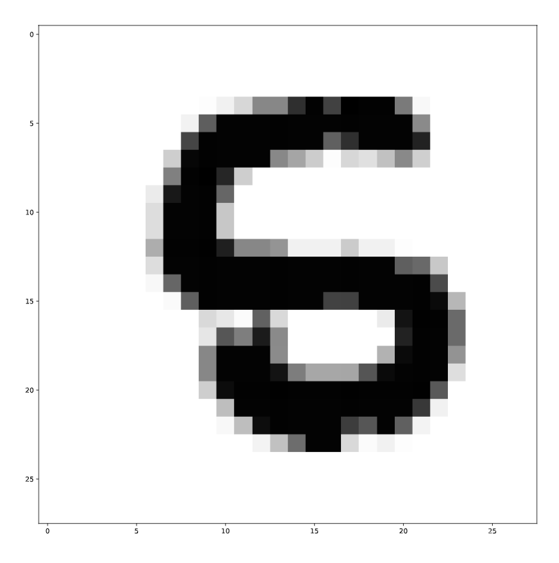
像素打印
# Import package
import numpy as np

# Assign filename to variable: file
file = 'digits.csv'

# Load file as array: digits
digits = np.loadtxt(file, delimiter=',')

# Print datatype of digits
print(type(digits))

# Select and reshape a row
im = digits[19, 1:] # 选定第19行,从第一列到最后一列
im_sq = np.reshape(im, (28, 28))

# Plot reshaped data (matplotlib.pyplot already loaded as plt)
plt.imshow(im_sq, cmap='Greys', interpolation='nearest')
plt.show()
轴格式化
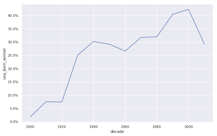
# Setting the plotting theme
sns.set()
# and setting the size of all plots.
import matplotlib.pyplot as plt
plt.rcParams['figure.figsize'] = [11, 7]

# Plotting USA born winners
ax = sns.lineplot(x = "decade", y = "usa_born_winner", data=prop_usa_winners)

# Adding %-formatting to the y-axis
from matplotlib.ticker import PercentFormatter
# ... YOUR CODE FOR TASK 4 ...
ax.yaxis.set_major_formatter(PercentFormatter(1.0))