Seaborn DataV Std.
Seaborn DataV Std.
作者:韩佳明Hirsun
笔者认为,seaborn可作为数据可视化的首选。
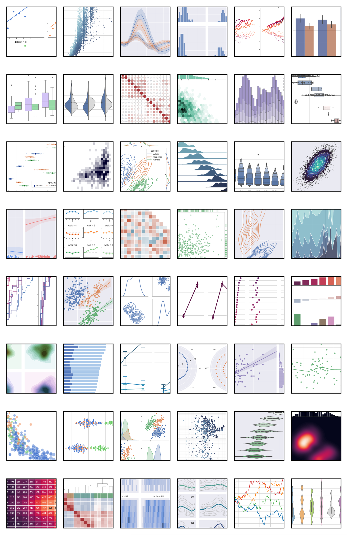
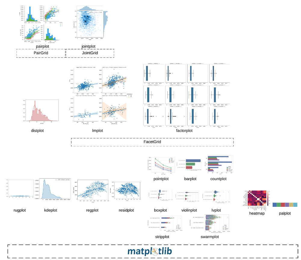
Example gallery: https://seaborn.pydata.org/examples/index.html
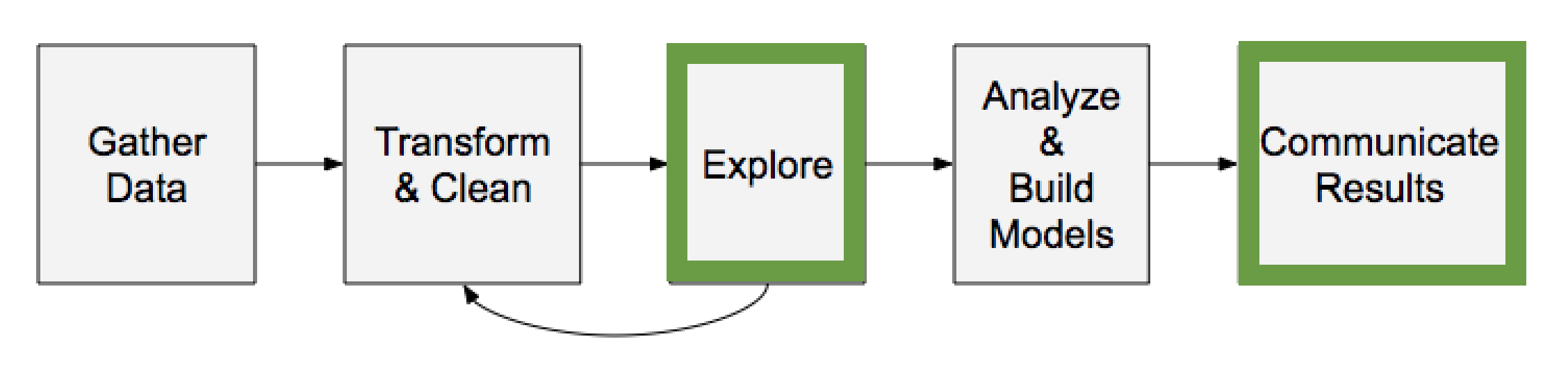
前言
基于Pandas和matplotlib
x轴和y轴可以相互调换。
Use default
# with dataframe
import pandas as pd
import matplotlib.pyplot as plt
import seaborn as sns

df = pd.read_csv("masculinity.csv")
sns.countplot(x="how_masculine",data=df)
plt.show()
# with list
import seaborn as sns
import matplotlib.pyplot as plt
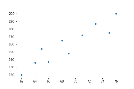
height = [62, 64, 69, 75, 66, 68, 65, 71, 76, 73]
weight = [120, 136, 148, 175, 137, 165, 154, 172, 200, 187]
sns.scatterplot(x=height, y=weight)
plt.show()
sns.set() # 同样可以把matplotlib设置成sns的默认样式
Why?
Scatter plot
import seaborn as sns
import matplotlib.pyplot as plt

height = [62, 64, 69, 75, 66, 68, 65, 71, 76, 73]
weight = [120, 136, 148, 175, 137, 165, 154, 172, 200, 187]
sns.scatterplot(x=height, y=weight)
plt.show()
count plot
import pandas as pd
import matplotlib.pyplot as plt
import seaborn as sns

df = pd.read_csv("masculinity.csv")
sns.countplot(x="how_masculine", data=df)
plt.show()
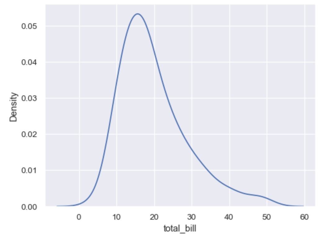
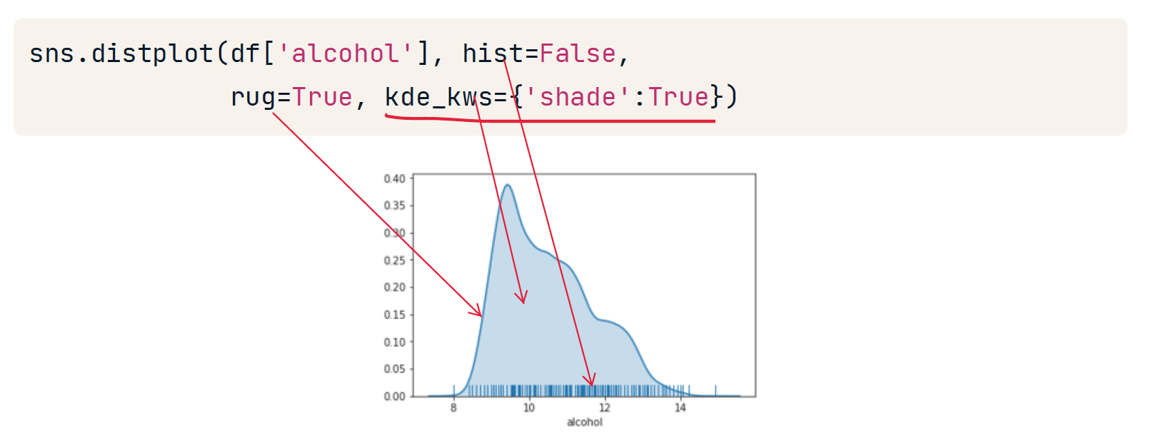
kdeplot
统计单变量密度
kdeplot 更丝滑
# bw_adjust 指定过拟合
sns.kdeplot(data=tips, x="total_bill", bw_adjust=5)
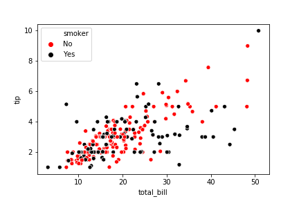
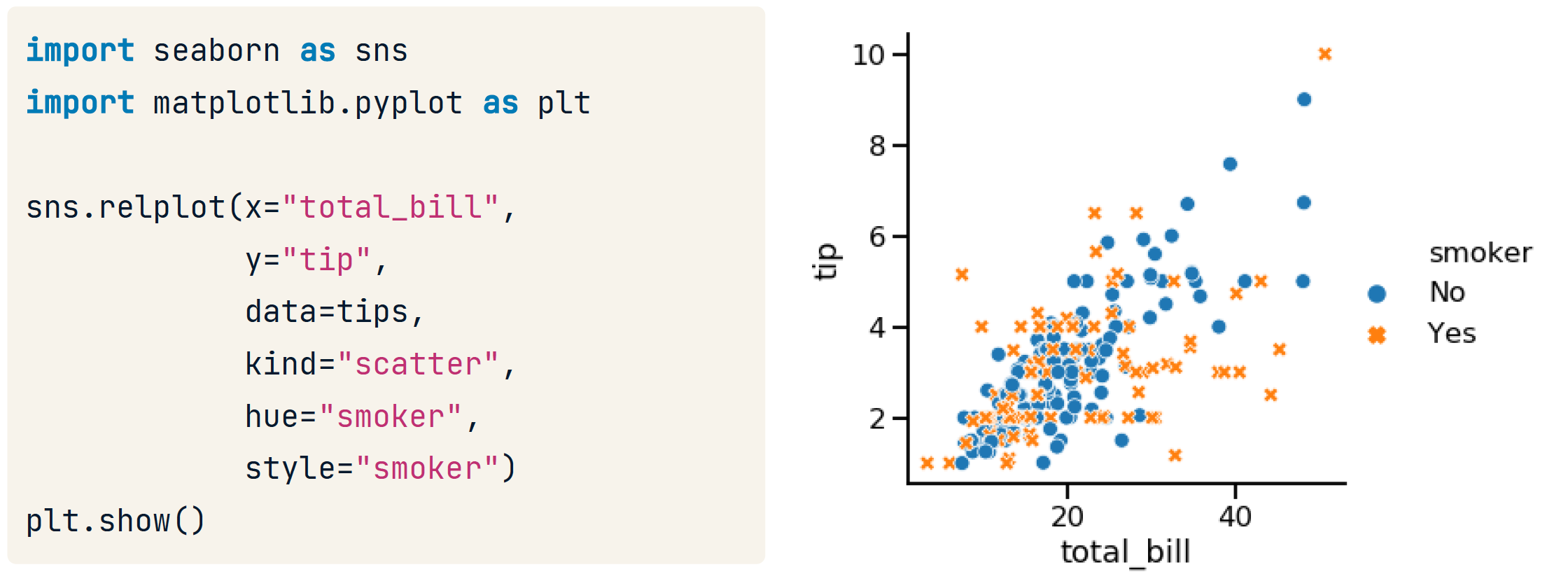
hue
可以指定hue,这将又增加一个维度,rug指定的列是另一个存放种类的列,采用的列的值的种类是有限的(产品质量好中坏)。相当于把x拆成了多个x.
import matplotlib.pyplot as plt
import seaborn as sns

hue_colors = {"Yes": "black",
              "No":"red"}

# HTML hex color codes: Green and Grey
# hue_colors = {"Yes": "#808080",
# 							"No": "#00FF00"}

sns.scatterplot(x= "total_bill", y= "tip", data=tips, hue="smoker", palette=hue_colors, hue_order = ["No", "Yes"])
plt.show()
例如,对以下数据
| decade | category | female_winner | |
|---|---|---|---|
| 0 | 1900 | Chemistry | 0.000000 |
| 1 | 1900 | Literature | 0.100000 |
| ... | 1901 | Medicine | 0.000000 |
| ... | 1901 | Peace | 0.071429 |
| ... | 1902 | Physics | 0.076923 |
有hue时
ax = sns.lineplot(x='decade', y='female_winner', hue='category', data=prop_female_winners)
ax.yaxis.set_major_formatter(PercentFormatter(1.0))
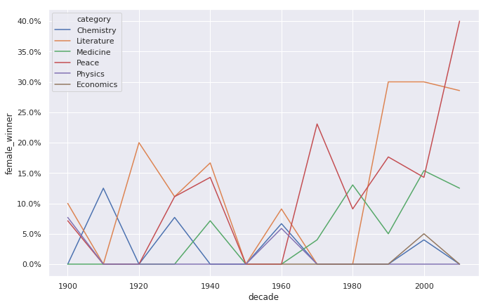
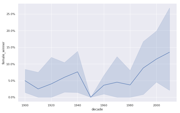
无 hue时
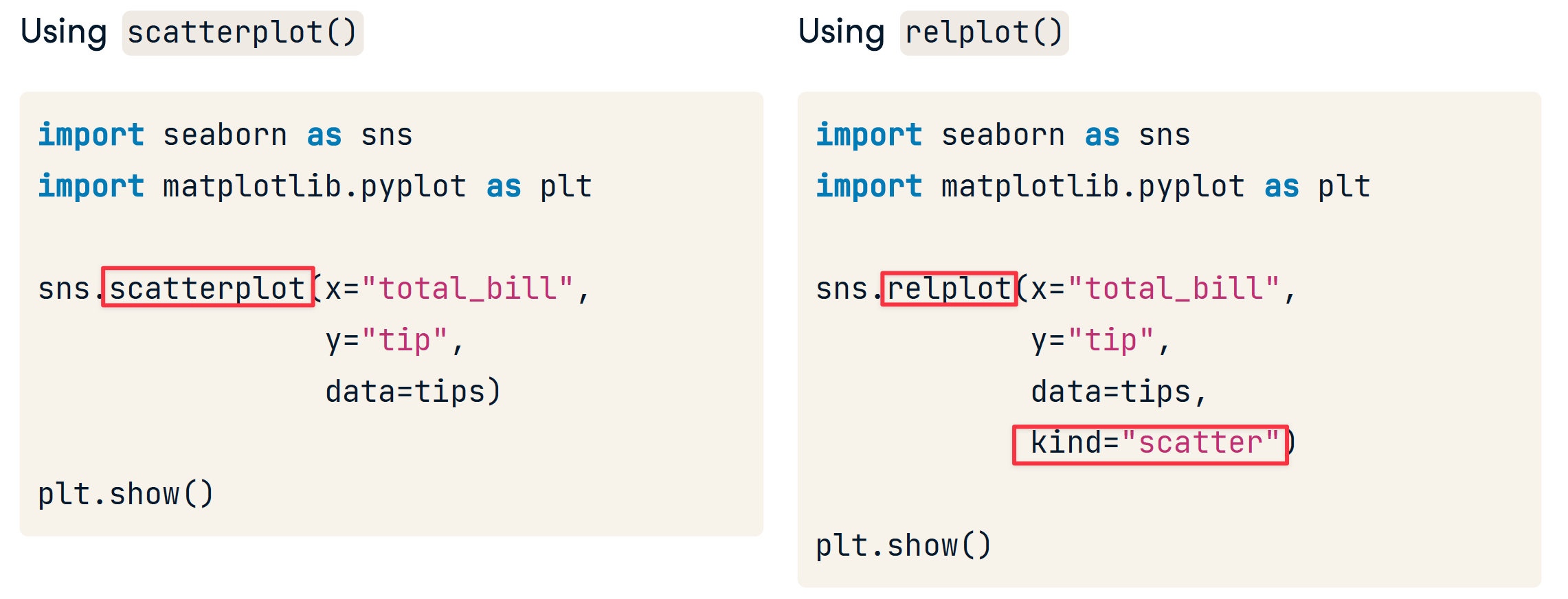
relplot
relplot() lets you create subplots in a single figure
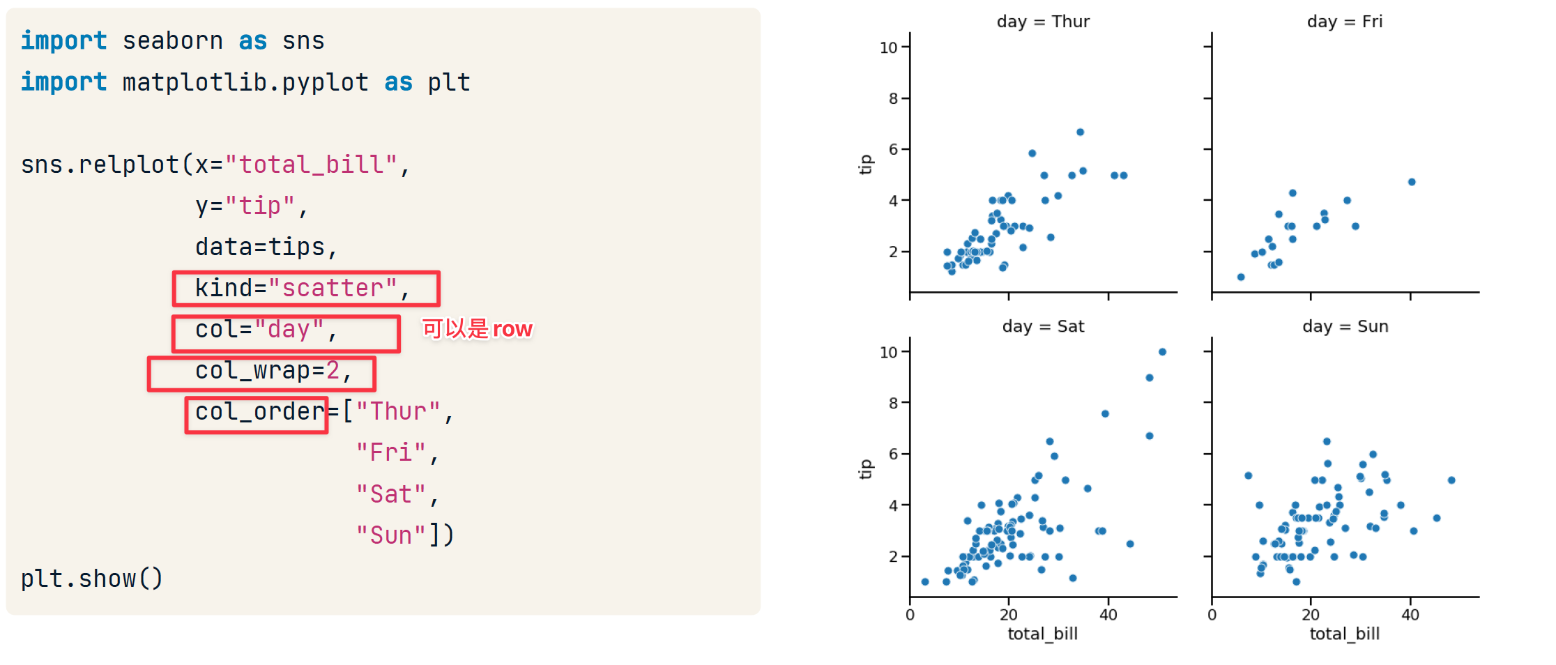
row & col
- col 和 row 用于创建子图
- hue 用于在同一个图中添加一个新列以区分,这是与col 和 row区分的
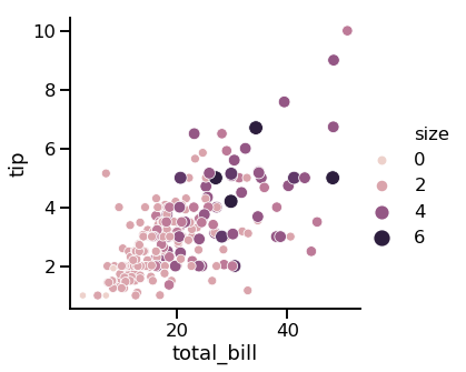
size
import seaborn as sns
import matplotlib.pyplot as plt

sns.relplot( x= "total_bill", y= "tip", data=tips, kind= "scatter", size="size", hue="size")
plt.show()
style
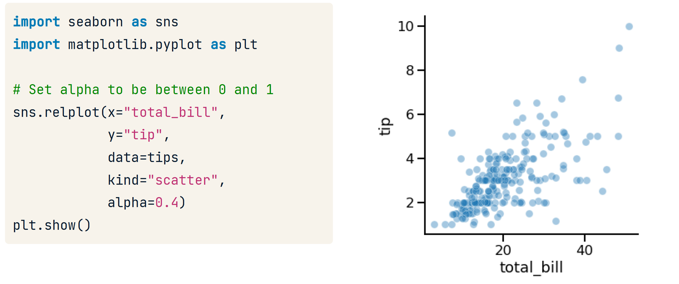
transparency
size
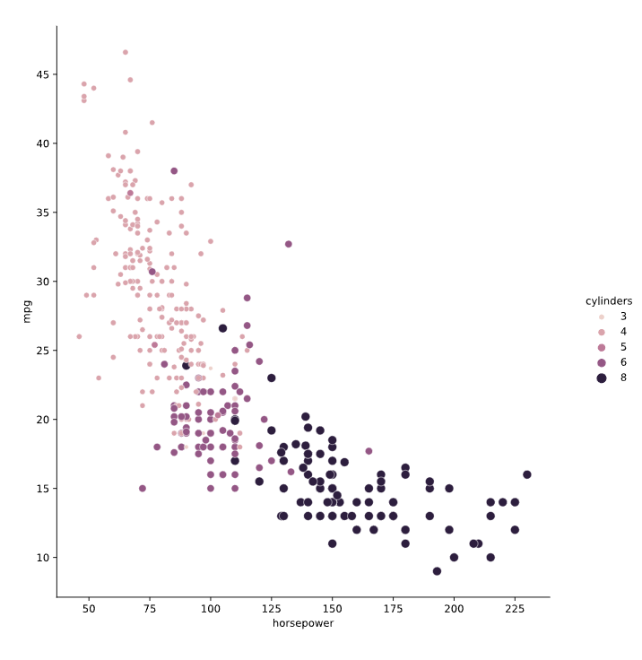
# Import Matplotlib and Seaborn
import matplotlib.pyplot as plt
import seaborn as sns

# Create scatter plot of horsepower vs. mpg
sns.relplot(x="horsepower", y="mpg",
            data=mpg, kind="scatter",
            size="cylinders",
            hue = "cylinders")

# Show plot
plt.show()
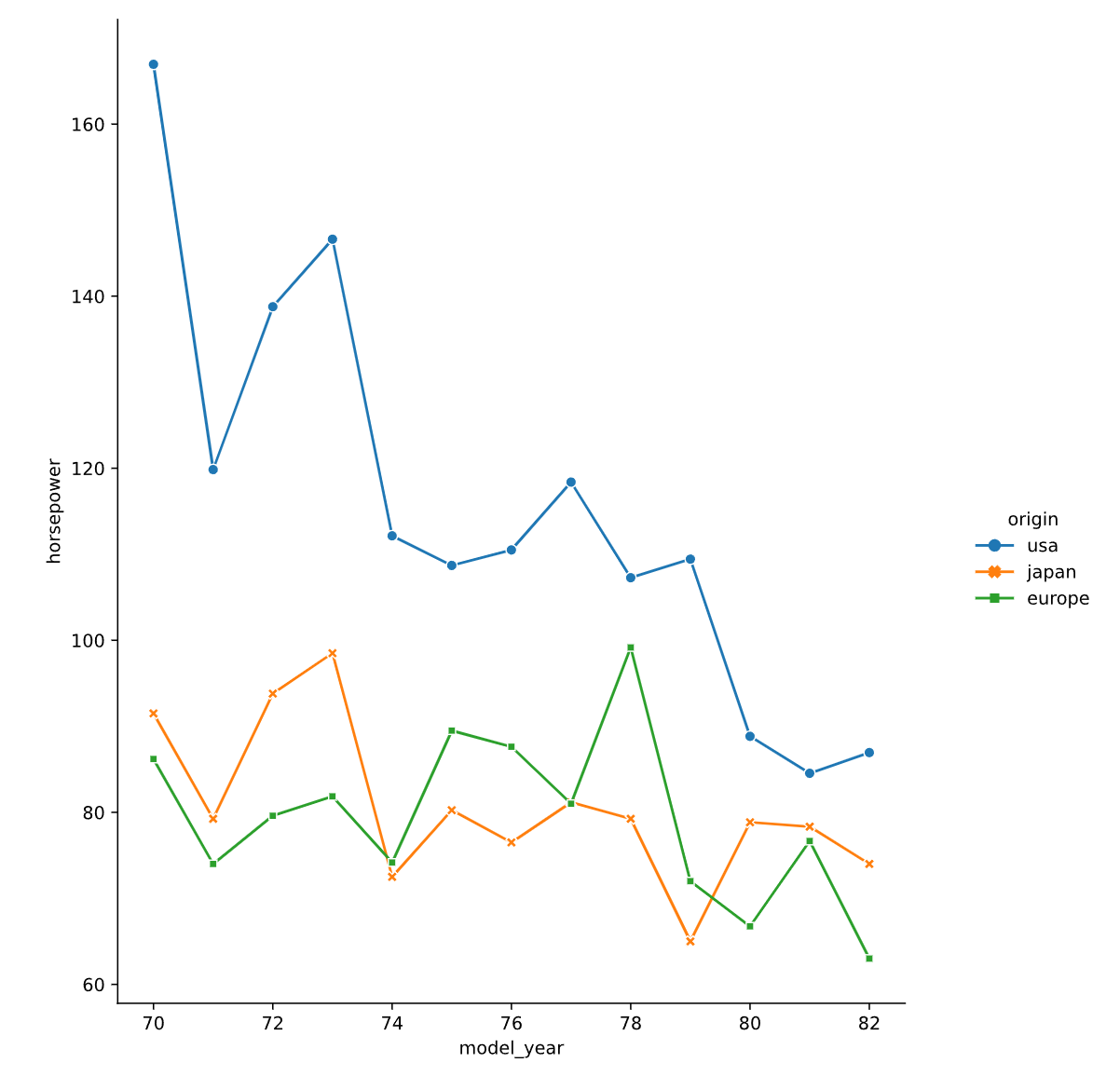
dash 和 maker
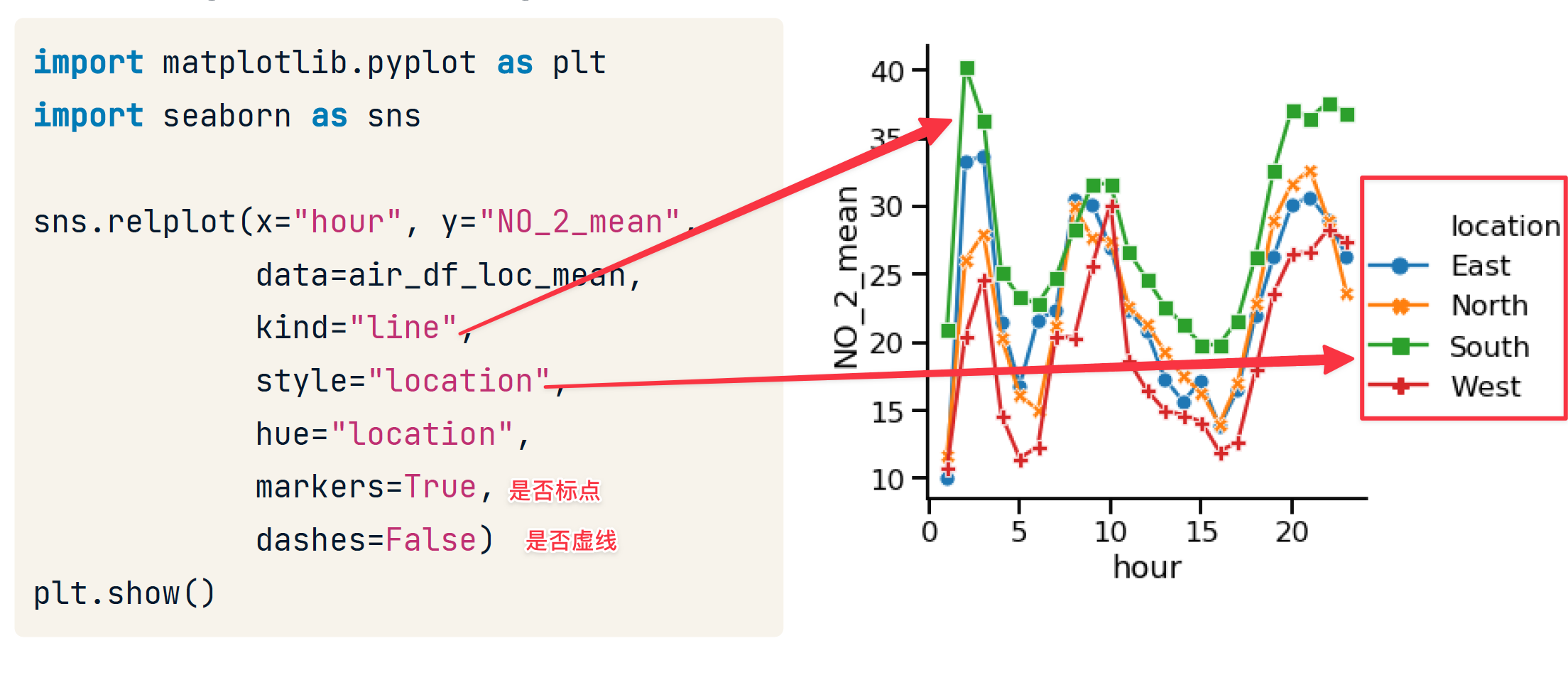
# Import Matplotlib and Seaborn
import matplotlib.pyplot as plt
import seaborn as sns

# Add markers and make each line have the same style
sns.relplot(x="model_year", y="horsepower",
            data=mpg, kind="line",
            ci=None, style="origin",
            hue="origin",
            dashes = False,
            markers = True)
# Show plot
plt.show()
line with regplot
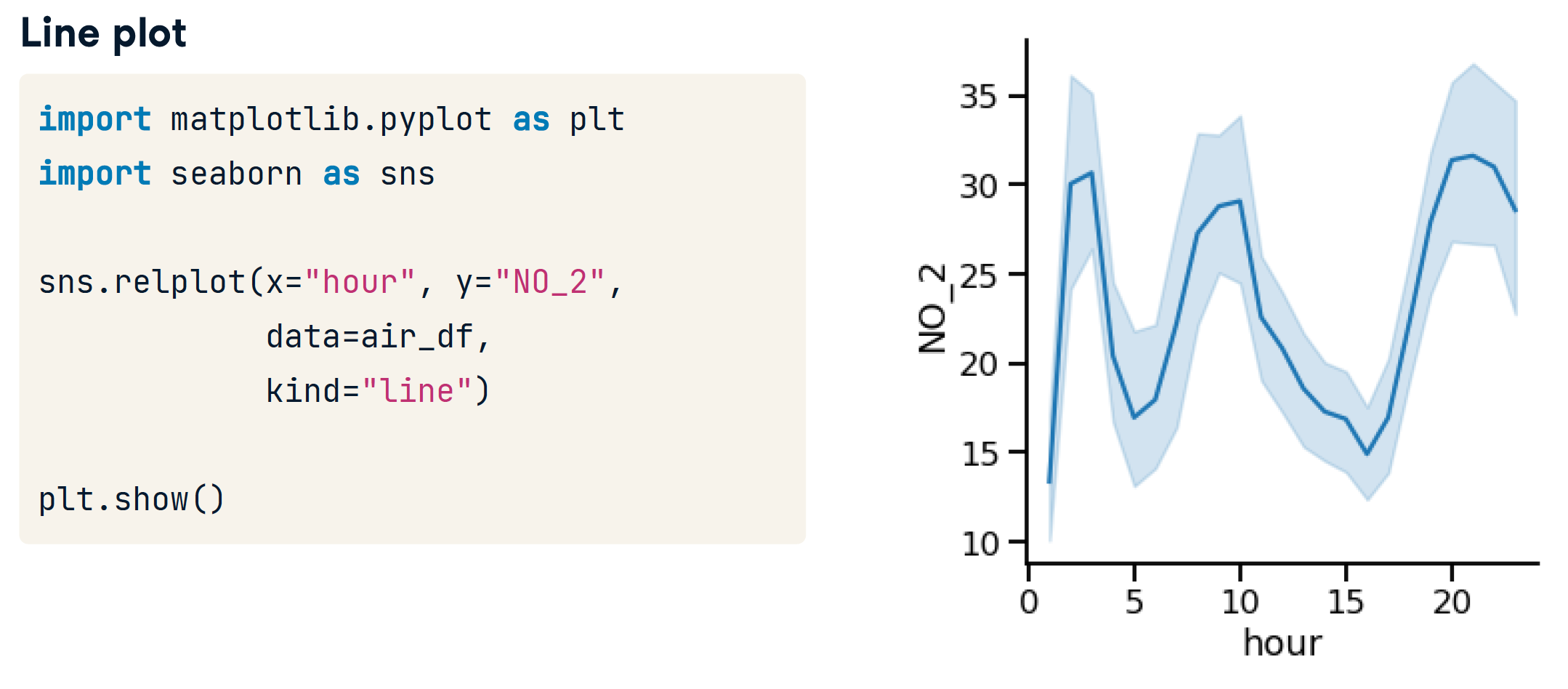
- 阴影区域是置信区间
- 95% condent that the mean is within thisinterval
- 表示我们估计的不确定性
# 用标准差代替置信区间
sns.relplot(x="hour", y="NO_2",data=air_df,kind="line",ci="sd")

# Turning off confidence interval
sns.relplot(x="hour", y="NO_2", data=air_df, kind="line", ci=None)
catplot
区分 categorical value (类化值) 和 quantified value(量化值),后期还会有时间值。
catplot 用于 创建分类图。通常一个轴 是量化值列。一个轴是类化值列。
- Same advantages of relplot()
- Easily create subplots with col= and row=
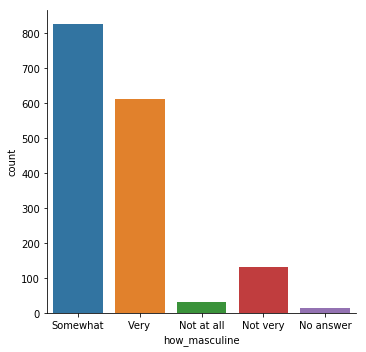
countplot
只需要指定一个轴,另一个轴显示x的每个类的个数。
当然,也可以指定y。
sns.countplot(x="how_masculine", data=masculinity_data)
# 等价于
sns.catplot(x="how_masculine", data=masculinity_data, kind="count")
barplot
sns.catplot(x="day", y="total_bill",data=tips,kind="bar")
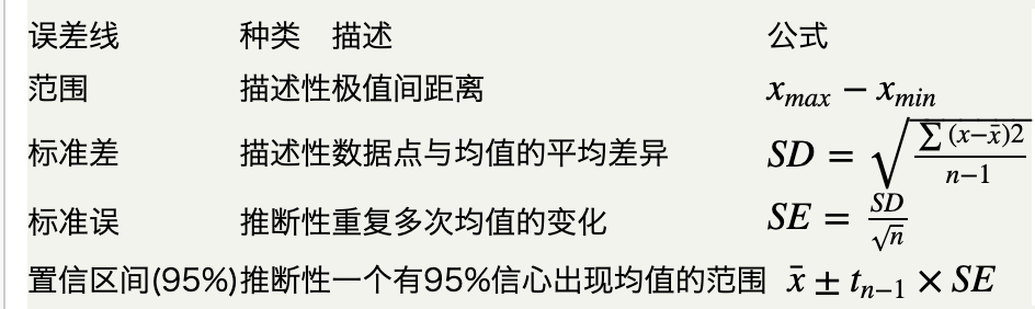
# 可以使用 ci = None 来删去误差线
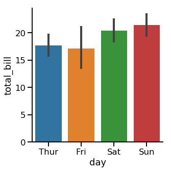
- Lines(也叫误差线) show 95% confidence intervals for the mean
- Shows uncertainty about our estimate
- Assumes our data is a random sample
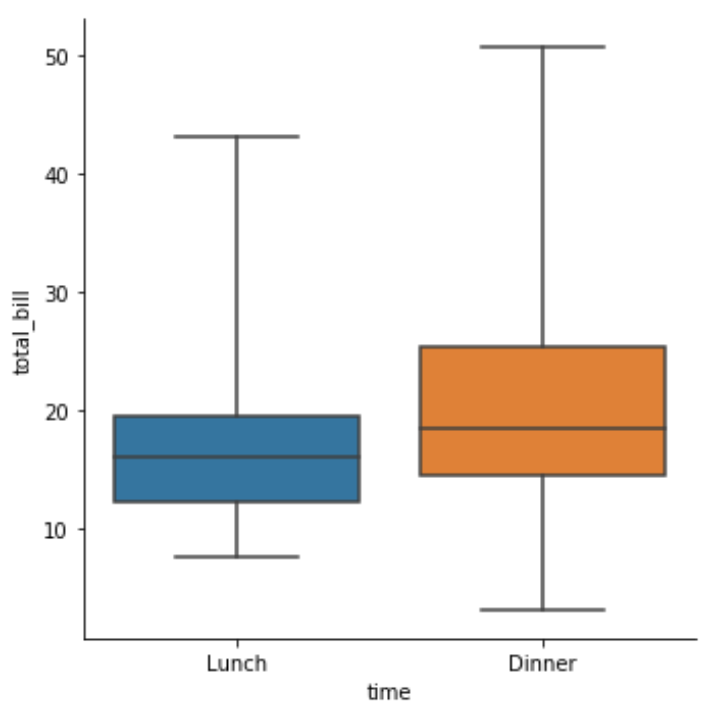
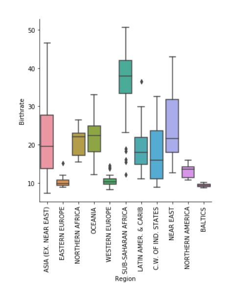
boxplot
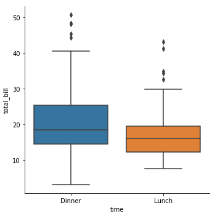
sns.catplot(x="time",y="total_bill",data=tips,kind="box",order=["Dinner","Lunch"])
ref. https://zhuanlan.zhihu.com/p/147645727
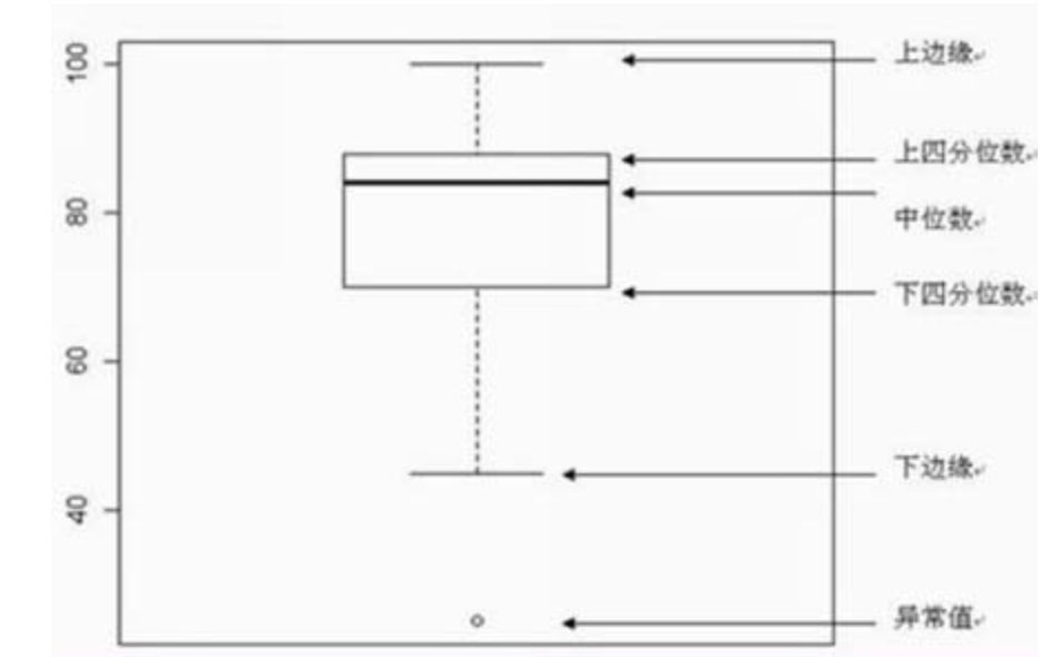
- 第一四分位数 (Q1),又称“较小四分位数”,等于该样本中所有数值由小到大排列后第25%的数字。
- 第二四分位数 (Q2),又称“中位数”,等于该样本中所有数值由小到大排列后第50%的数字。
- 第三四分位数 (Q3),又称“较大四分位数”,等于该样本中所有数值由小到大排列后第75%的数字。
- 第三四分位数与第一四分位数的差距又称四分位距(IQR)。
箱体图的组成如图所示,
- 上边缘,是上四分位数加上1.5倍的箱体;
- 下边缘是下四分位数减去1.5倍的箱体;
- 数据在上边缘以上或者下边缘以下,就称为离群值。
- 上箱体为上四分位数;下箱体为下四分位数;
- 箱体长度为上四分位数减去下四分位数。
- 参数
sym = "":去除离群值的展示 - 参数
whis- By default, the whiskers extend to 1.5 * the interquartile range
- Make them extend to 2.0 * IQR: whis=2.0
- Show the 5th and 95th percentiles: whis=[5, 95]
- Show min and max values: whis=[0, 100]
sns.catplot(x="time", y="total_bill", data=tips, kind="box", whis=[0, 100])
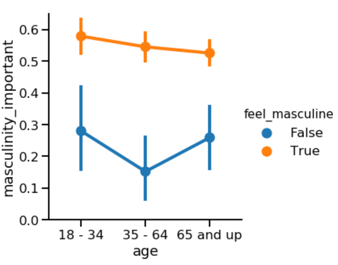
pointplot
- Points show mean of quantitative variable
- Vertical lines show 95% con,dence intervals
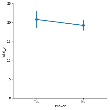
Both show:
- Mean of quantitative variable
- 95% con,dence intervals for the mean
Differences:
- Line plot has quantitative variable (usually time) on x-axis
- Point plot has categorical variable on x-axis
sns.catplot(x="age", y="masculinity_important", data=masculinity_data, hue="feel_masculine", kind="point")
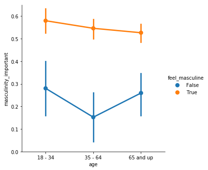
- 参数
join=False: 取消误差线的显示 estimator = numpy.median: 由于一个x可能对应多个y,不设置该参数时表示使用平平均值。设置后可以将点位改为中位数。- capsize=0.2 设置盖顶横线的长度
ci = "None"关闭显示置信区间
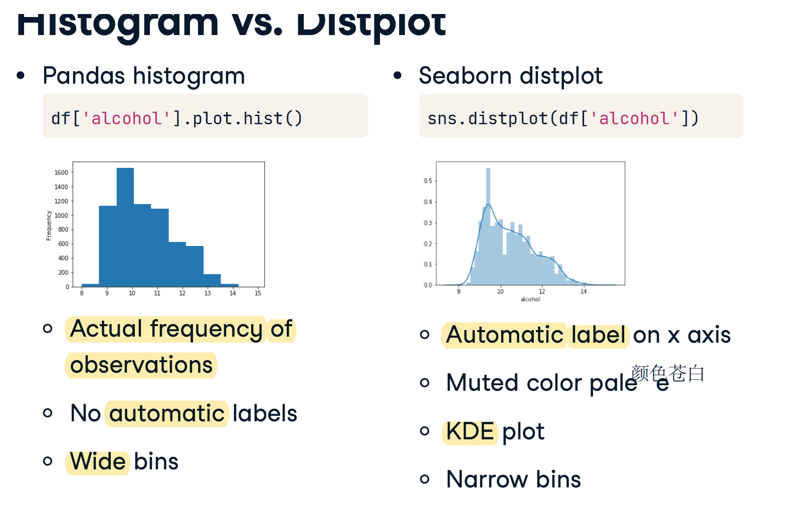
displot
相当于matplotlib的hist
displot将 rugplot(),kdeplot()和matplotlib的hist和三为一
- 适用于画出某一列区间分布
- 比如某一列是温度,图表将温度自动分好区间,并统计个数,将每个区间的个数呈现在y上
- 统计的值必须是数值或者时间(连续的值)
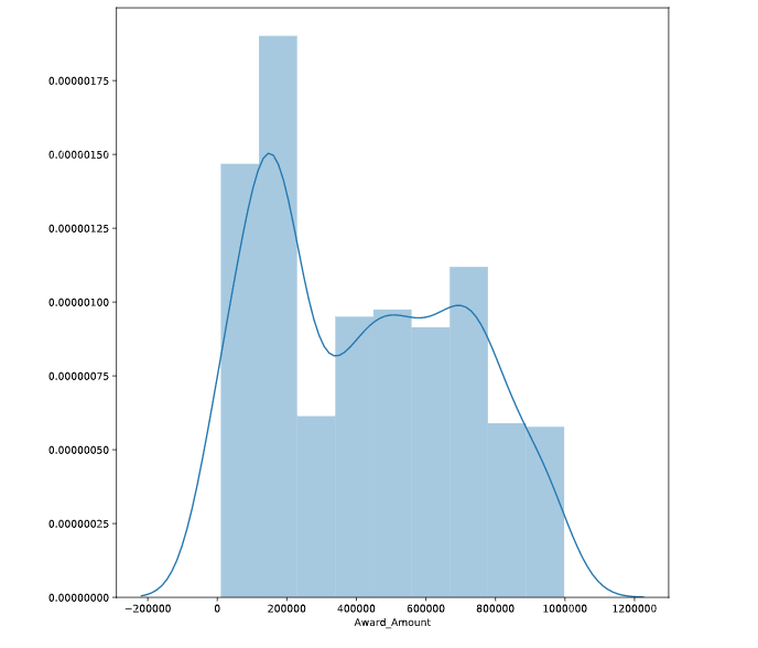
# Display a Seaborn distplot
# 只接受一个DF sns.distplot(DF)
sns.distplot(df['Award_Amount'])
plt.show()

# Clear the distplot
plt.clf()
Common parameters
可以对自变量使用限制区间,比如xlim=(0,25000)
Regression Plots
regplot 和 lmplot 几乎完全一样,但是
- regplot 没有参数 aspect, 但是 x 轴宽度会自适应
- regplot 没有参数 row, 不能一次性绘制多个图
regplot
- 给定DFx,DFy,将DFx对应的DFy的值呈现出来
- 一个x和一个y确定一个点或者多个点
- index有序,DFx呈现会自动排序
- 用于表示大量相对无规律值的分布特点
统计的值可以是数值或者时间(连续的值),也可以是 Categorical values
用来基于已有数据在图像中展现出回归直线
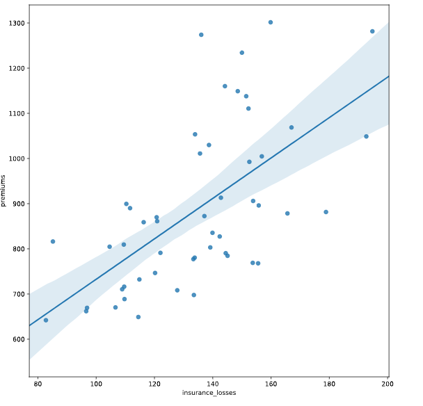
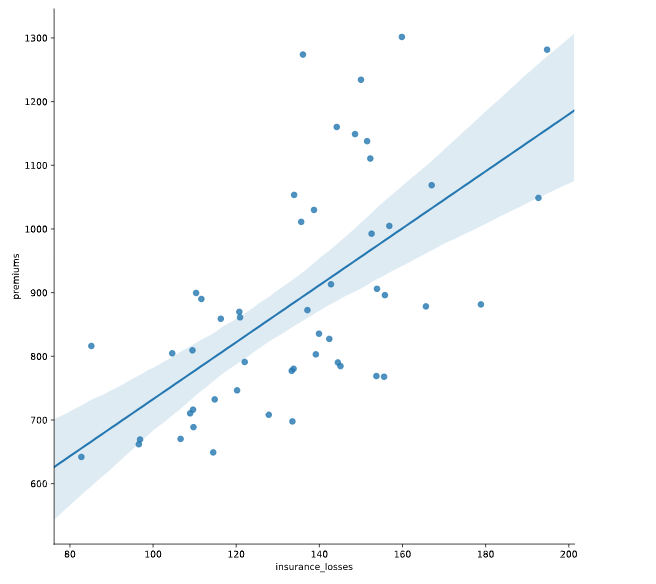
# Create an lmplot of premiums vs. insurance_losses

# 一次只画一个数据集
# 可以在下面指定参数 marker='+'
sns.lmplot(y = "premiums",x = 'insurance_losses', data = df)

# Display the second plot
plt.show()
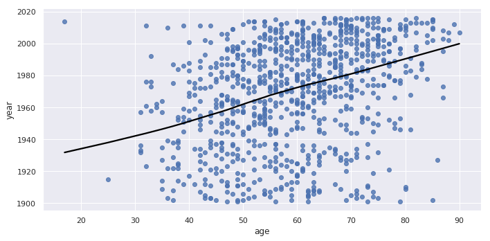
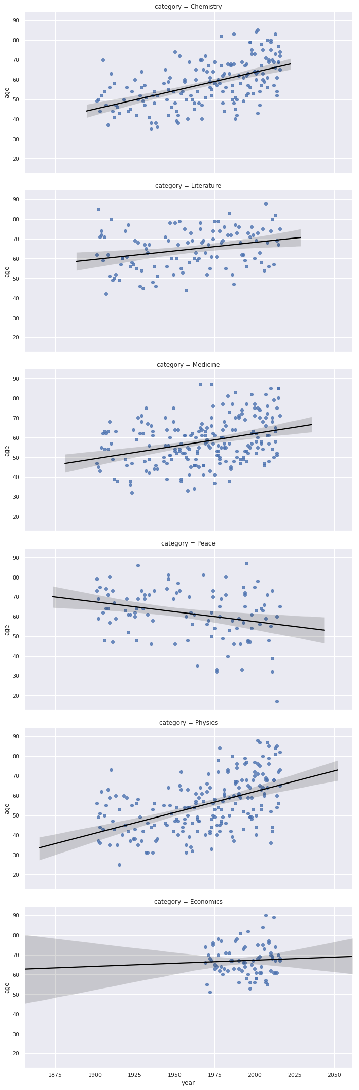
# Plotting the age of Nobel Prize winners
sns.lmplot(y = "year", x = "age", data = nobel, lowess=True,
           aspect=2, line_kws={'color' : 'black'})

# lowess 关闭折线区域
# aspect 控制x轴长度,即图片的宽度
sns.regplot(y = "age", x = "year", row='category', aspect=2, line_kws={'color' : 'black'}, data = nobel)
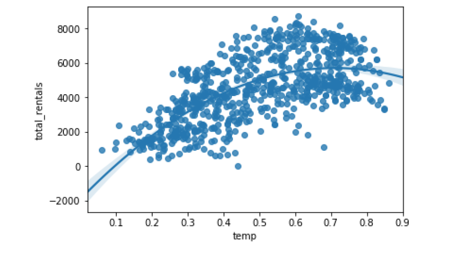
order
sns.regplot(data=df, x='temp', y='total_rentals', order=2)
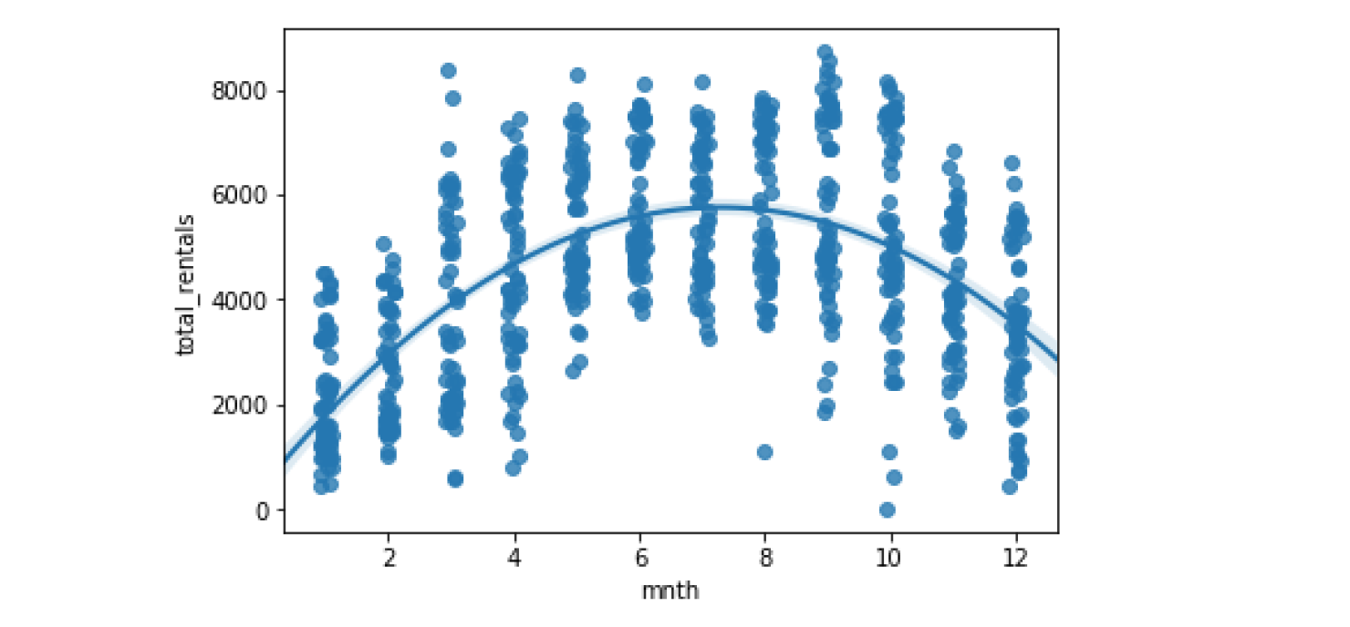
x_jitter
Seaborn也支持分类变量的回归绘图。 看看租金在各个月内如何变化可能很有意思。 在此示例中,使用抖动参数使得更容易看到每个月的租赁值的各个分配。
sns.regplot(data=df, x='mnth', y='total_rentals', x_jitter=.1, order=2)
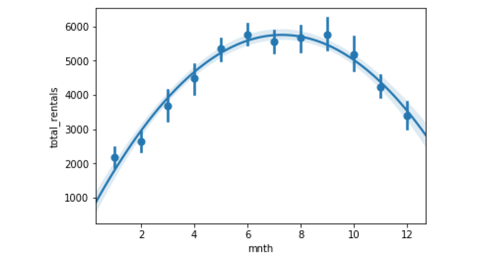
x_estimator
sns.regplot(data=df, x='mnth', y='total_rentals', x_estimator=np.mean, order=2)
In some cases, an x_estimator can be useful for highlighting trends
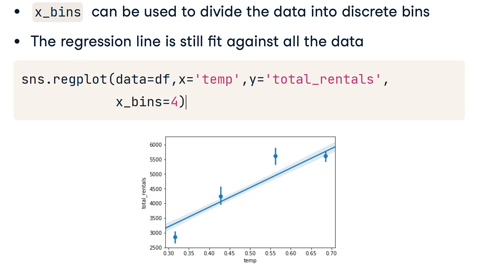
Binning the data
当存在连续变量时,将它们分成不同的 bins 可能会有所帮助。 在这种情况下,我们可以将温度分成四个bins,Seaborn将照顾计算这些垃圾箱并策划结果。 这比尝试使用熊猫或其他一些机制更快地创建箱子。 此快捷功能可以帮助快速读取诸如温度的连续数据。
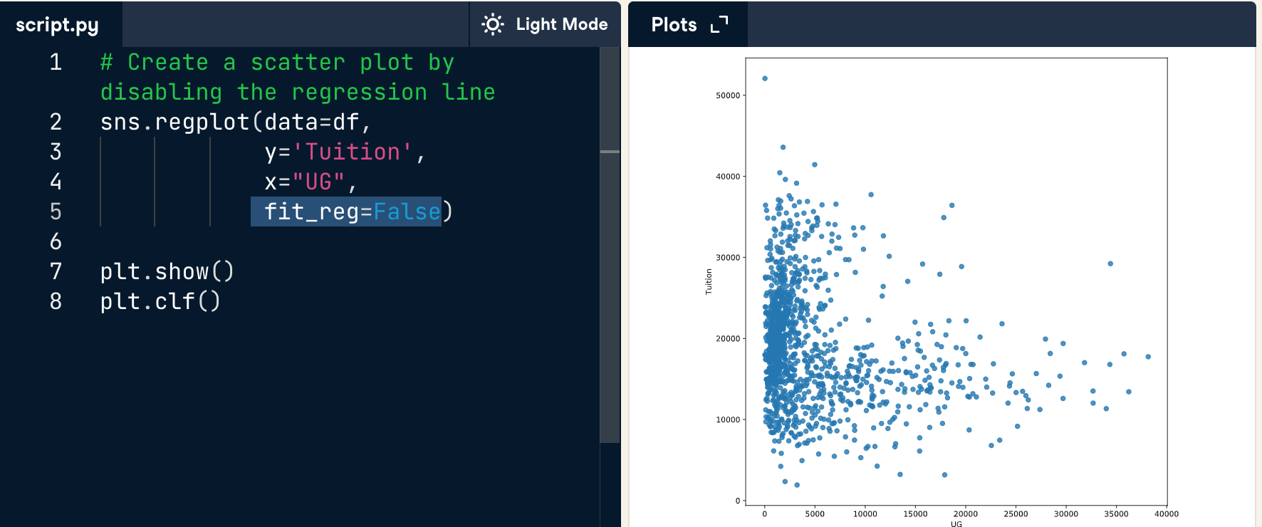
disable reg line
Evaluating regression
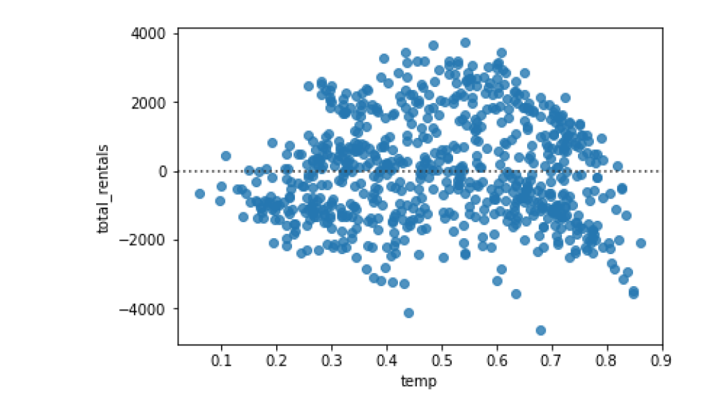
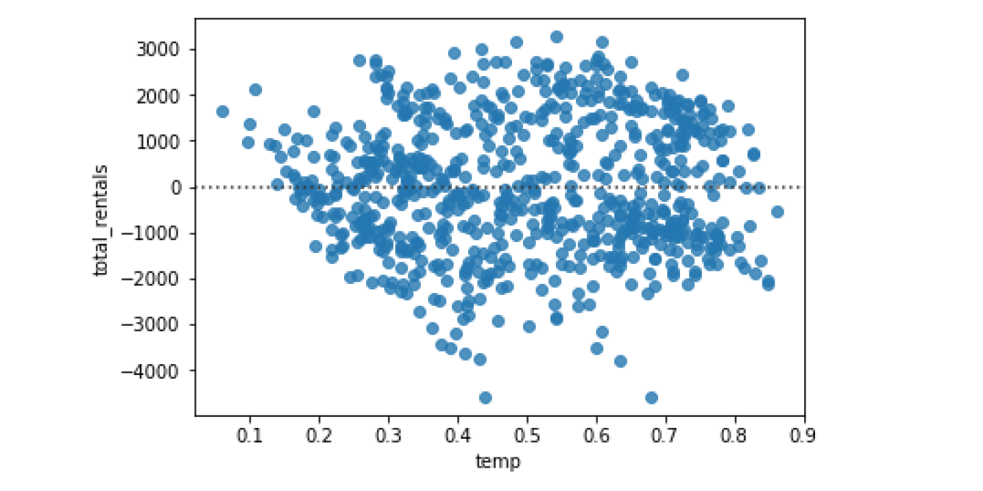
Evaluating regression with residplot()
画残差图
sns.residplot(data=df, x='temp', y='total_rentals')
sns.residplot(data=df, x='temp', y='total_rentals', order=2)
implot
和regplot很相似,但是比它更高级
# Create an lmplot of premiums vs. insurance_losses
sns.lmplot(y = "premiums",x = 'insurance_losses', data = df)

# Display the second plot
plt.show()
# 和 regplot 相比,下面的图似乎只是没有了上边框和右边框
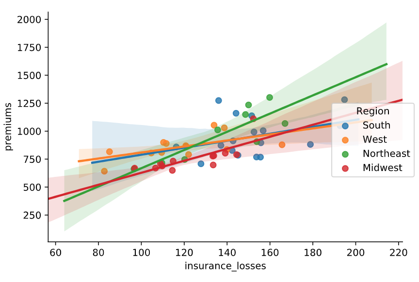
参数 hue
Organize data by colors (hue)
# Create a regression plot using hue
# 一般只画一次
sns.lmplot(data=df,
           x="insurance_losses",
           y="premiums",
           hue="Region")
# Show the results
plt.show()
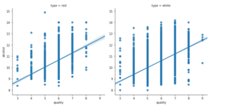
参数 col & row
sns.lmplot(x="quality",
  y="alcohol",
  data=df,
  col="type")
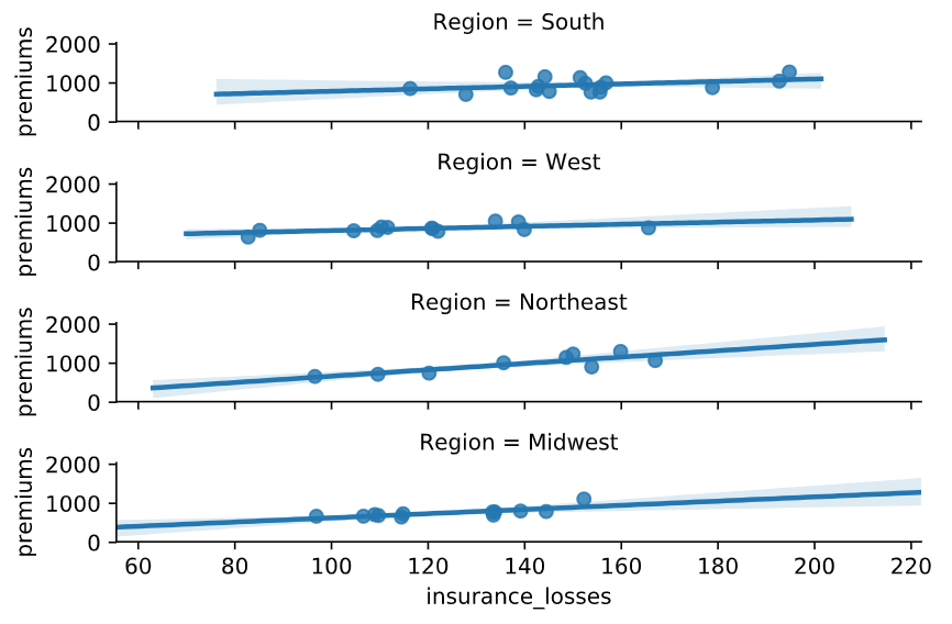
# Create a regression plot with multiple rows
sns.lmplot(data=df,
           x="insurance_losses",
           y="premiums",
           row="Region")

# Show the plot
plt.show()
Style
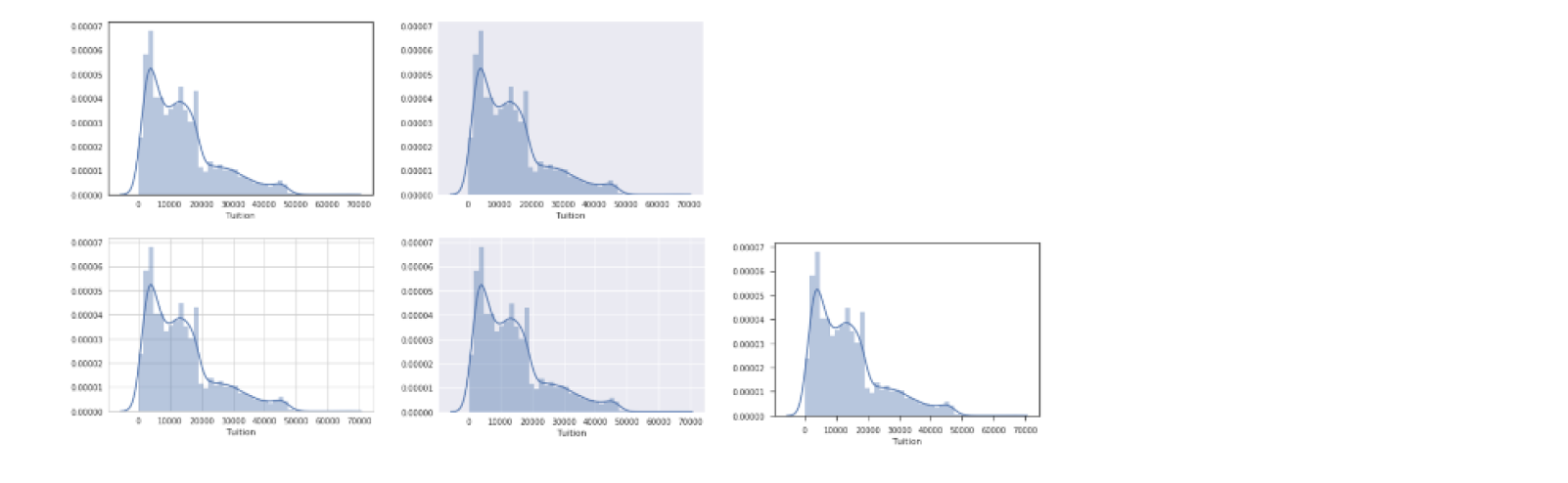
set_style()
for style in ['white','dark','whitegrid','darkgrid','ticks']:
  sns.set_style(style)
  sns.distplot(df['Tuition'])
  plt.show()
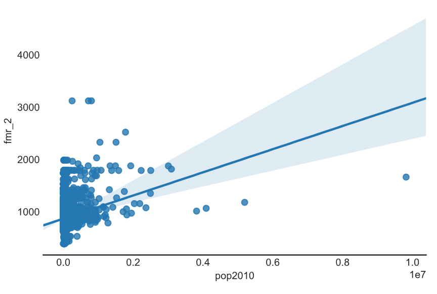
Remove the spines
# Set the style to white
sns.set_style('white')

# Create a regression plot
sns.lmplot(data=df,
           x='pop2010',
           y='fmr_2')

sns.despine(left=True)

# Show the plot and clear the figure
plt.show()
plt.clf()
Defining a color
use matplotlib to assign
Seaborn supports assigning colors to plots using matplotlib color codes
sns.set(color_codes=True)
sns.distplot(df['Tuition'], color='g')
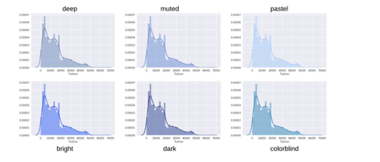
use Palettes
for p in sns.palettes.SEABORN_PALETTES:
  sns.set_palette(p)
  sns.distplot(df['Tuition'])
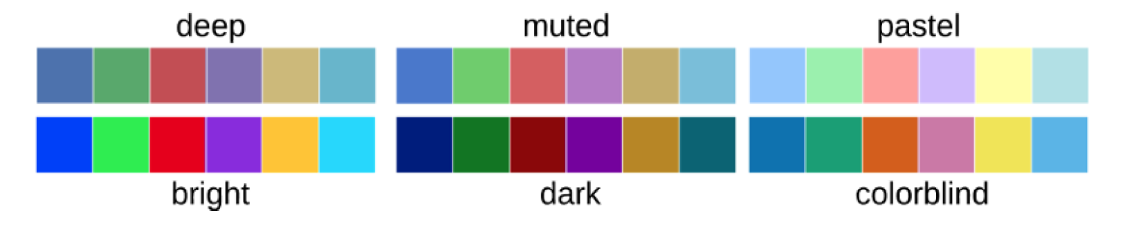
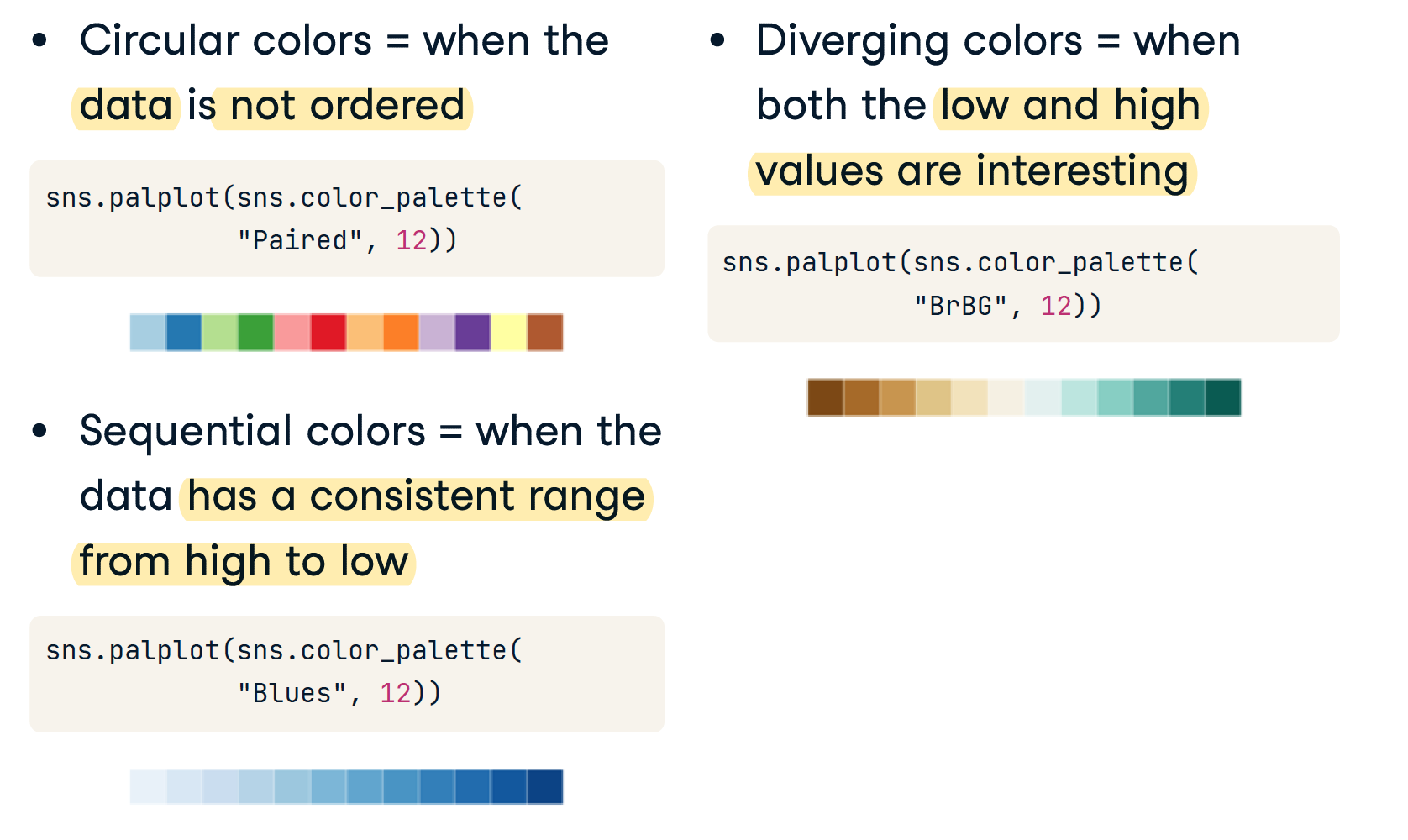
Displaying Palettes
- Seaborn uses the set_palette() function to define a palette
- sns.color_palette() returns the current palette
- sns.palplot() function displays a palette
一般地,palette影响的是一张图内的多个曲线的颜色,而不是子图之间的颜色。
for p in sns.palettes.SEABORN_PALETTES:
  sns.set_palette(p)
  sns.palplot(sns.color_palette())
  plt.show()
Defining Custom Palettes
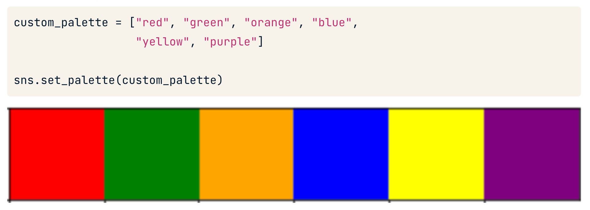
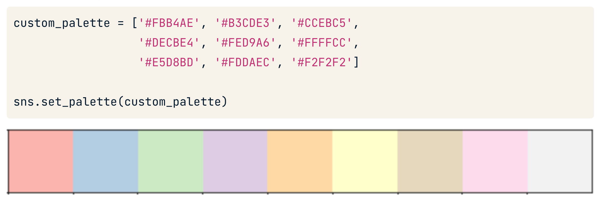
use in plot
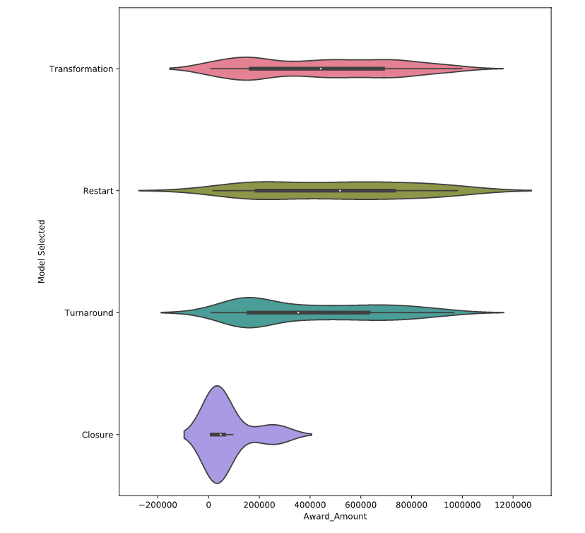
# Create a violinplot with the husl palette
sns.violinplot(data=df,
         x='Award_Amount',
         y='Model Selected',
         palette='husl')

plt.show()
plt.clf()
set_context()
Smallest to largest: "paper" , "notebook" , "talk" , "poster"
sns.set_context("talk")
Plots of each observation
- 用于描述每一类别值的大小分布
- 指定y,y是存放种类的列,采用的列的值的种类是有限的(苹果香蕉梨)
- 将每个类别对应的多个x值点在图上。
- 统计的值必须是数值或者时间(连续的值)
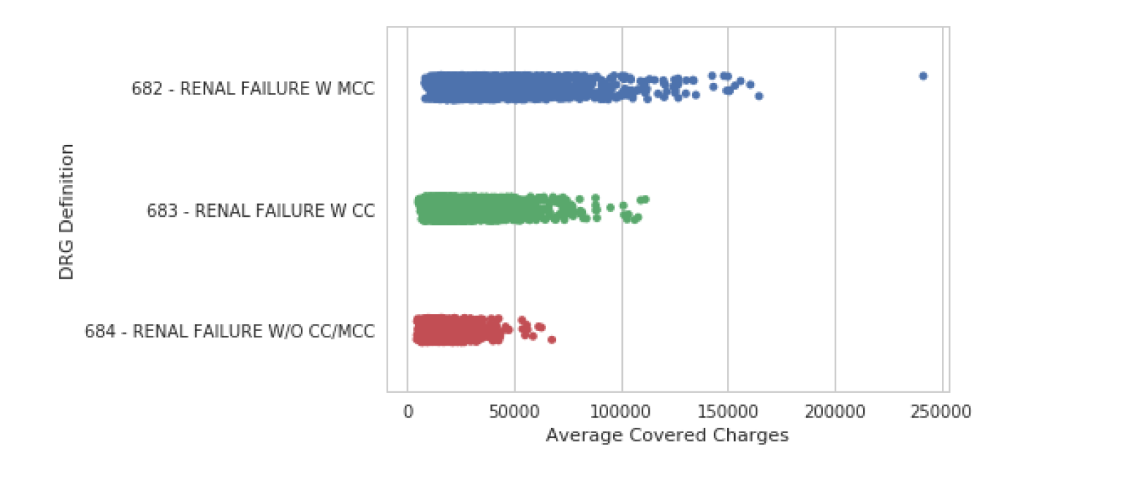
stripplot
Seaborn 的 stripplot() 显示数据集中的每个观察值。在某些情况下,可能很难看到单个数据点。我们可以使用 jitter 参数来更轻松地查看平均承保费用如何随诊断报销代码而变化。
sns.stripplot(data=df, y="DRG Definition",x="Average Covered Charges",jitter=True)
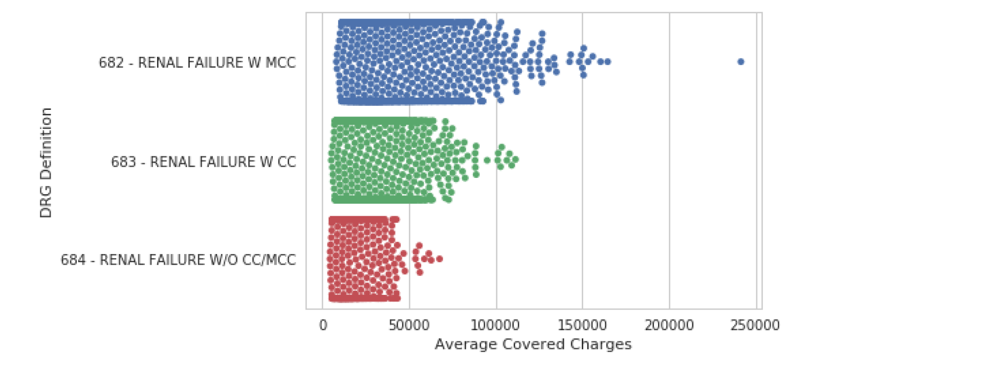
swarmplot
和stripplot很相似。
我们可以使用 swarmplot() 绘制所有数据的更复杂的可视化。该图使用复杂的算法以不重叠的方式放置观察结果。这种方法的缺点是 swarmplot() 不能很好地扩展到大型数据集。
sns.swarmplot(data=df, y="DRG Definition", x="Average Covered Charges")
Abstract representations
可以指定hue,这将又增加一个维度,rug指定的列是另一个存放种类的列,采用的列的值的种类是有限的(产品质量好中坏)。相当于把x拆成了多个x.
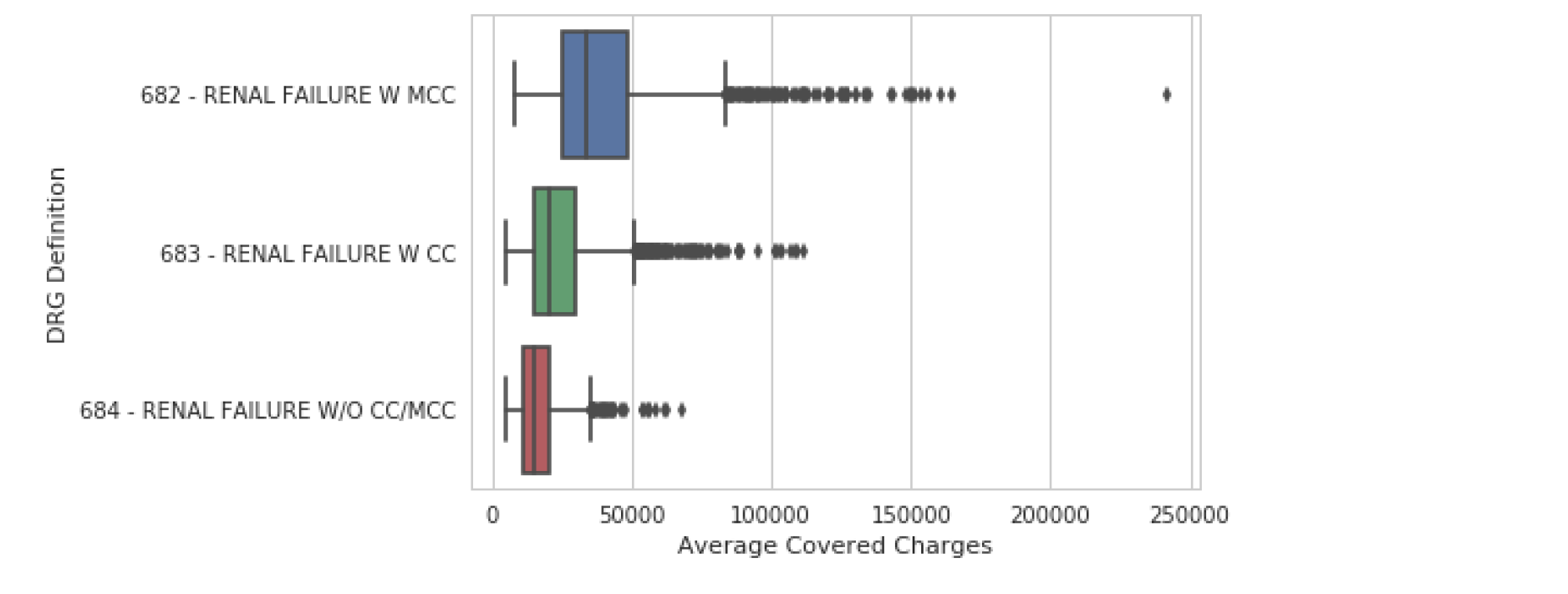
boxplot
下一类图显示了数据的抽象表示。boxplot() 是这种类型中最常见的。该图用于显示与数据分布相关的几个度量,包括中位数、上四分位数和下四分位数以及异常值。
- 统计的值必须是数值或者时间(连续的值)
- 指定y,y是存放种类的列,采用的列的值的种类是有限的(苹果香蕉梨)
- 每一列的值的特征将呈现在图上(x轴)(比如产量)
- 用于表示大量相对无规律值的分布特点
实例:评价不同水果的产量
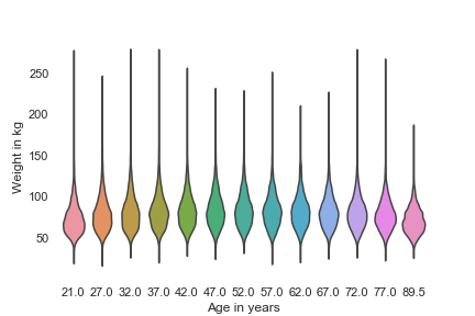
violinplot
和箱型图相似
violinplot() 是核密度图和箱线图的组合,适用于提供数据分布的替代视图。因为该图使用核密度计算,所以它不显示所有数据点。这对于显示大型数据集很有用,但创建起来可能需要大量计算。
sns.violinplot(x='AGE', y='WTKG3', data=data, inner=None)
plt.show()
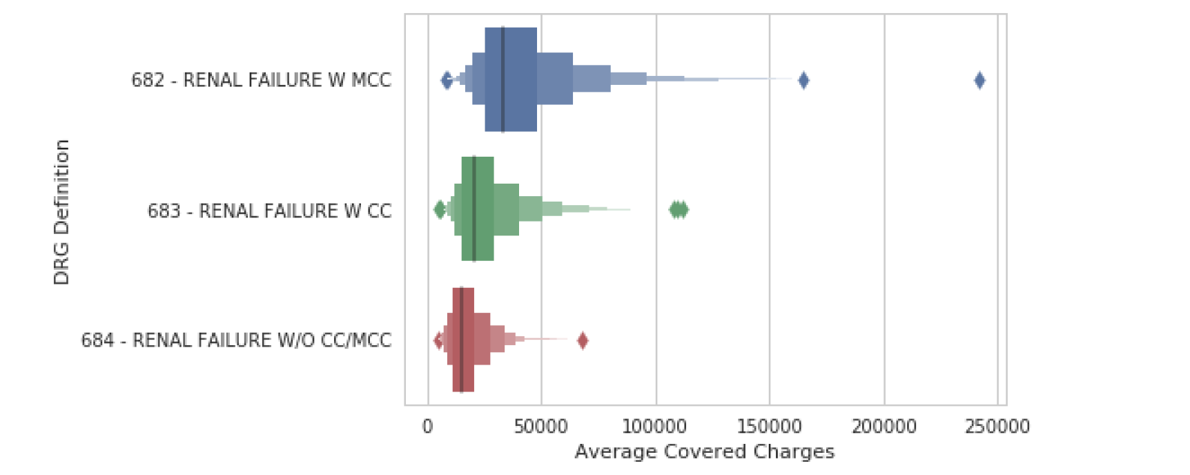
lvplot
sns.lvplot(data=df, y="DRG Definition", x="Average Covered Charges")
该分组中的最后一个图是 lvplot(),它代表字母值图。API 与 boxplot() 和 violinplot() 相同,但可以更有效地扩展到大型数据集。lvplot() 是 boxplot() 和 violinplot() 的混合体,渲染速度相对较快且易于解释。
Statistical estimates
可以指定hue,这将又增加一个维度,rug指定的列是另一个存放种类的列,采用的列的值的种类是有限的(产品质量好中坏)。相当于把x拆成了多个x.
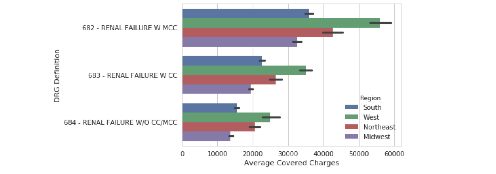
barplot
最后一类图是数据的统计估计。barplot() 显示了对值的估计以及置信区间。在这个例子中,我们包含了第 1 章中描述的色调参数,它为我们查看这些分类数据提供了另一种有用的方法。
给定一个y列,展现y对应的x的值。
- 统计的值必须是数值或者时间(连续的值)
- 指定y,y是存放种类的列,采用的列的值的种类是有限的(苹果香蕉梨),且是唯一的,不重复的
- 每个种类的对应的x值将呈现(x)
- 适用于值的种类有限
sns.barplot(data=df, y="DRG Definition",x="Average Covered Charges",hue="Region")
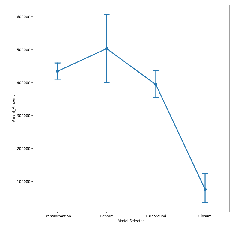
pointplot
pointplot() 与 barplot() 相似,因为它显示了一个汇总度量和置信区间。pointplot() 对于观察值如何跨分类值变化非常有用。
和barplot相同,不过会连线
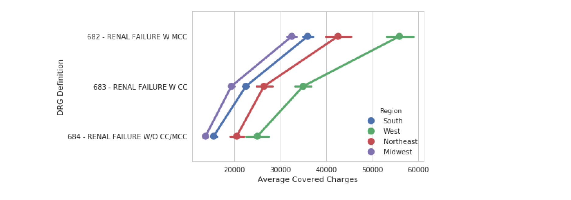
# Create a pointplot and include the capsize in order to show caps on the error bars
sns.pointplot(data=df,
         y='Award_Amount',
         x='Model Selected',
              capsize=.1) # capsize 加个帽子

plt.show()
plt.clf()
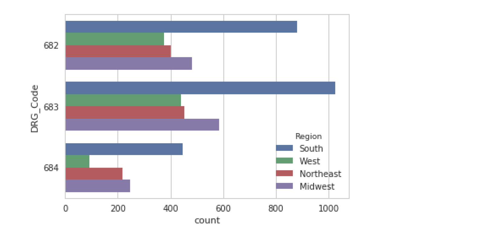
countplot
类似于barplot,不过是只有y,就统计y列下每一种值的个数,而不是直接呈现y对应的x的个数
sns.countplot(data=df, y="DRG_Code", hue="Region")
Matrix Plots
grid format
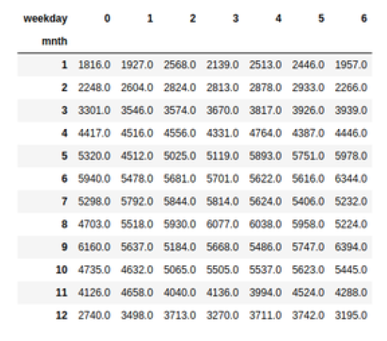
pd.crosstab(df["mnth"], df["weekday"], values=df["total_rentals"],aggfunc='mean').round(0)
# values 指的是将x和y形成对应的值的函数结构,考虑到x和y对应的值可能不只有一个。
# round 控制保留小数位
heatmap
sns.heatmap(df_crosstab, annot=True, fmt="d", cmap="YlGnBu", cbar=True, center=df_crosstab.loc[9, 6])
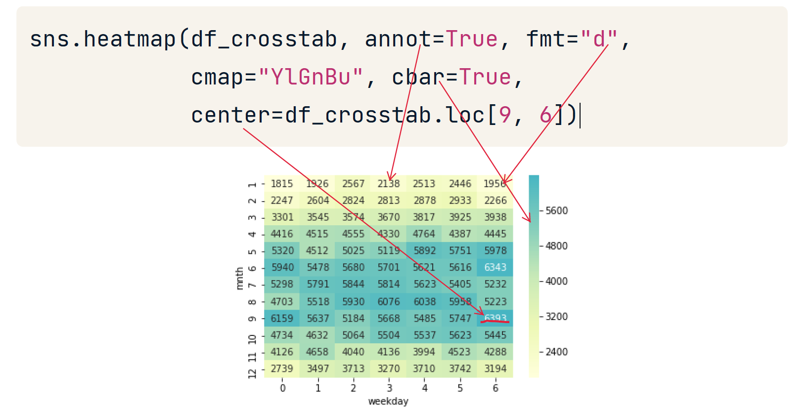
一般的,颜色越浅值越大。不过可以使用参数center重新设置焦点。
correlation matrix
Pandas corr function calculates correlations between columns in a dataframe
df.corr()
sns.heatmap(df.corr())
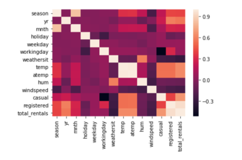
在上图中,颜色越浅,表明两列的相关性越高。
Grid Plots
指定属性列,把把一个图拆成多个图,把属性相同的行的数据放到一个同一个图中。
Tidy data
- Seaborn's grid plots require data in "tidy format"
- One observation per row of data
# g = sns.FaceGrid(df,col = xxx, row = xxx, col_order = xxx,row_order = xxx) 这一步指定怎样切割图
# g.map(sns.xxx,"which_col_name") 指定图的样式 和 数据源参数,order也可以在这里指定
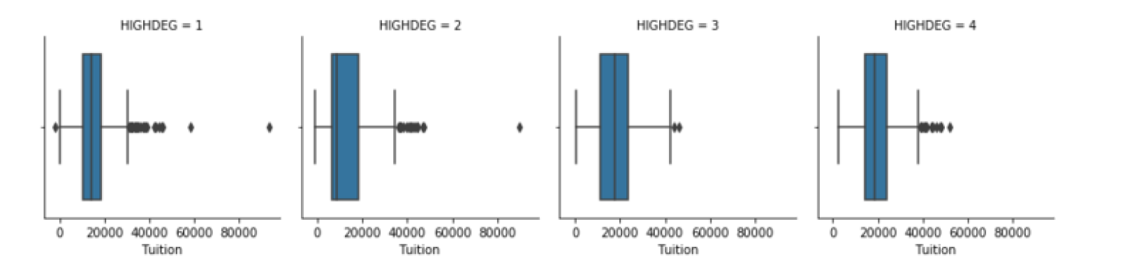
g = sns.FacetGrid(df, col="HIGHDEG")
g.map(sns.boxplot, 'Tuition',order=['1', '2', '3', '4']) #map 这一步是必须的 ,这里的boxplot只指定了一个参数
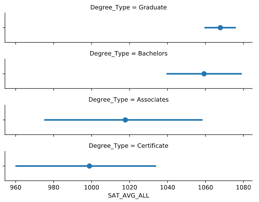
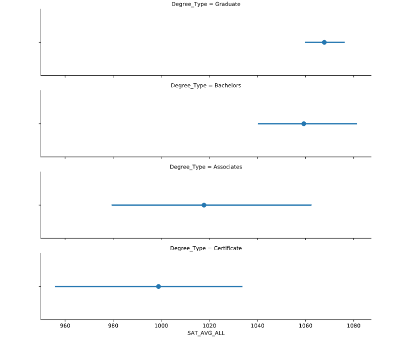
# Create FacetGrid with Degree_Type and specify the order of the rows using row_order
g2 = sns.FacetGrid(df,
             row="Degree_Type",
             row_order=['Graduate', 'Bachelors', 'Associates', 'Certificate'])

# Map a pointplot of SAT_AVG_ALL onto the grid
g2.map(sns.pointplot, 'SAT_AVG_ALL',) # 没有y轴

# Show the plot
plt.show()
plt.clf()
factorplot()
更加快捷的画grid plots
# Create a facetted pointplot of Average SAT_AVG_ALL scores facetted by Degree Type
sns.factorplot(data=df,
        x='SAT_AVG_ALL',
        kind='point', #kind 可以指定 scatter box 等,别忘了kde也是一种kind
        row='Degree_Type',
        row_order=['Graduate', 'Bachelors', 'Associates', 'Certificate'])

plt.show()
plt.clf()
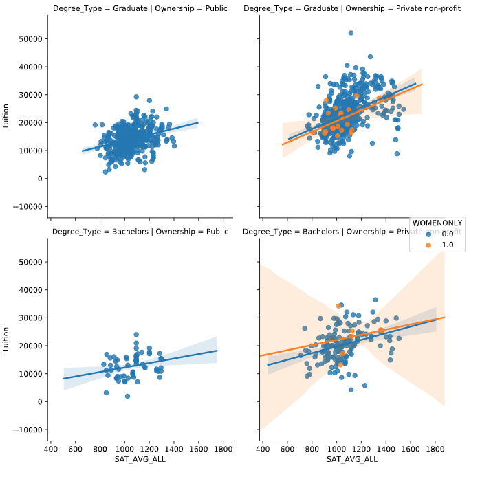
lmplot
给lmplot指定col 和 row等参数实现 grid plots
下面实现了三个属性维度
# Create an lmplot that has a column for Ownership, a row for Degree_Type and hue based on the WOMENONLY column
sns.lmplot(data=df,
        x='SAT_AVG_ALL',
        y='Tuition',

        col="Ownership",
        col_order=inst_ord
        row='Degree_Type',
        row_order=['Graduate', 'Bachelors'],

        hue='WOMENONLY',
        )

plt.show()
plt.clf()
Pair Plot
由 x 和 y 定位一个或者多个值
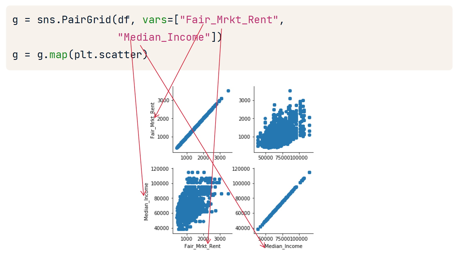
PairGrid
g = sns.PairGrid(df, vars=["Fair_Mrkt_Rent", "Median_Income"])
g = g.map(plt.scatter)
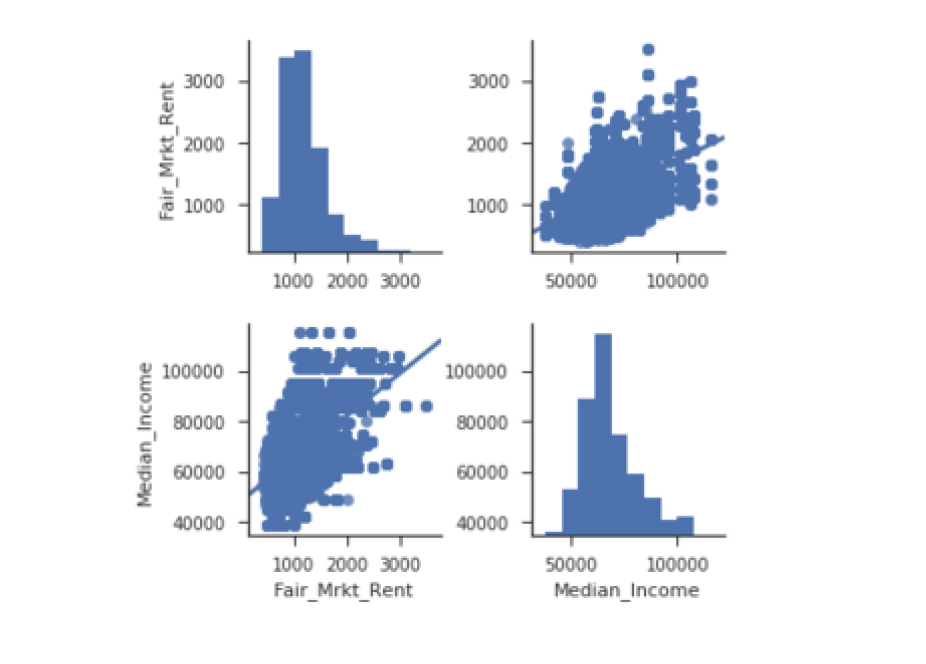
sns.pairplot(df, vars=["Fair_Mrkt_Rent","Median_Income"], kind='reg',diag_kind='hist')
# kind 指定丿 diag_king指定 捺
# kind 和 diag_kind 默认参数是scatter
pairplot
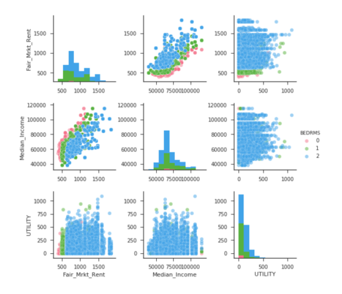
sns.pairplot(df.query('BEDRMS < 3'),
             vars=["Fair_Mrkt_Rent","Median_Income", "UTILITY"],  # 随机组合3x3 = 9
             hue='BEDRMS', palette='husl',  #palette将影响不同hue的颜色
             plot_kws={'alpha': 0.5})   # 改变透明度
# 如果不指定kind将智能分配合适的kind
高度自定义:自定义x和y
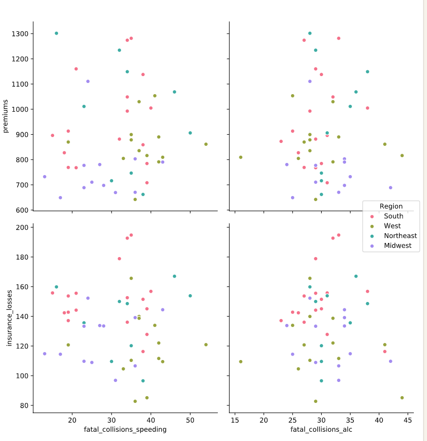
# Build a pairplot with different x and y variables
sns.pairplot(data=df,
        x_vars=["fatal_collisions_speeding", "fatal_collisions_alc"], #指定x
        y_vars=['premiums', 'insurance_losses'], #指定y
        kind='scatter',
        hue='Region',
        palette='husl')

plt.show()
plt.clf()
Joint plot
JointGrid
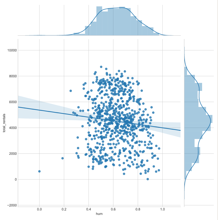
# Build a JointGrid comparing humidity and total_rentals
sns.set_style("whitegrid")
g = sns.JointGrid(x="hum", y="total_rentals",
            data=df,
            xlim=(0.1, 1.0))

# 指定呈现regplot和distplot,也可以用g.plot_joint(sns.xxx)实现
g.plot(sns.regplot, sns.distplot)

plt.show()
plt.clf()
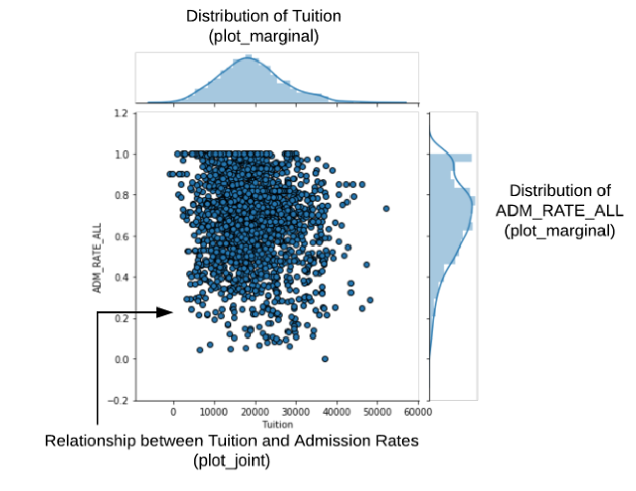
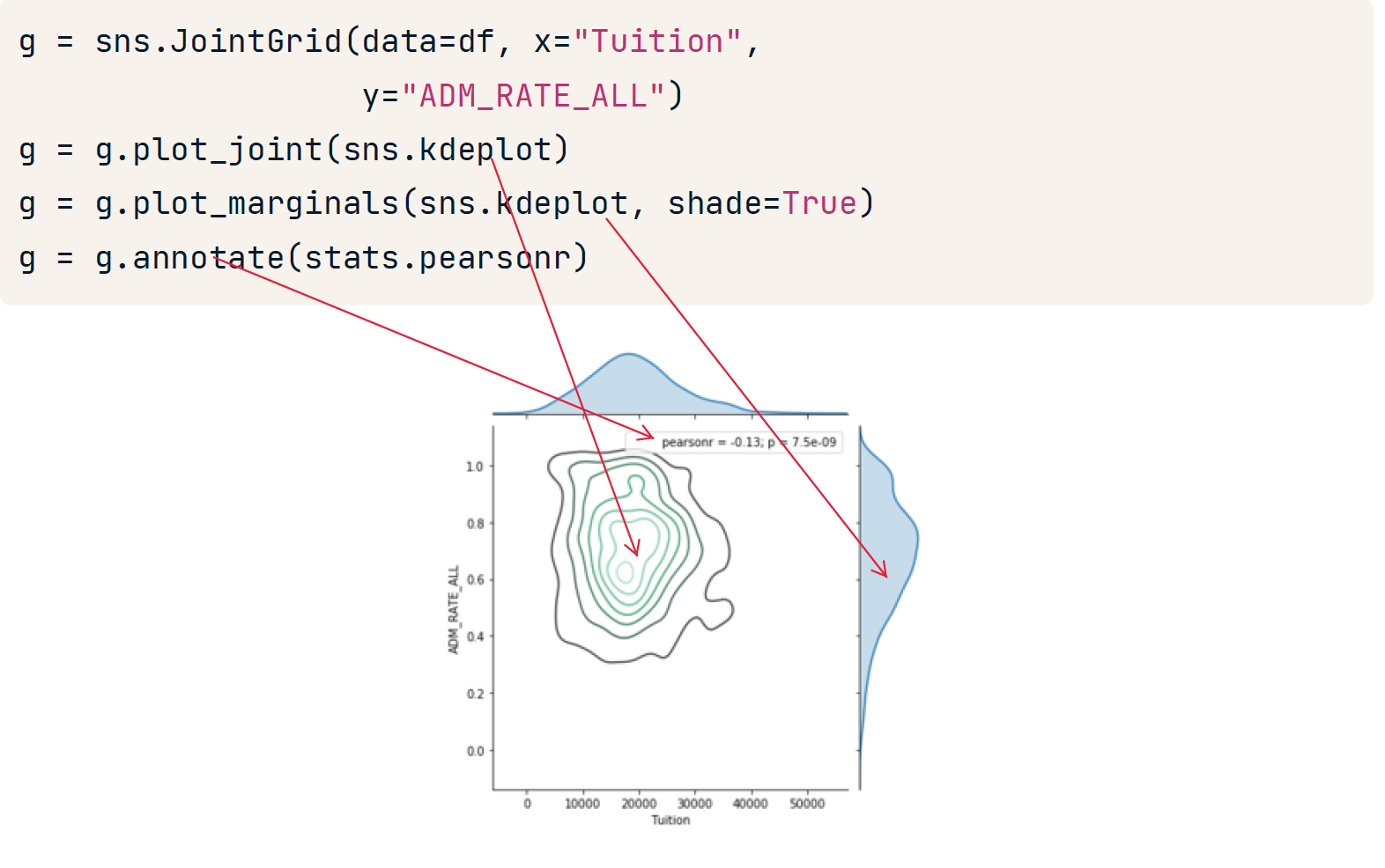
g = sns.JointGrid(data=df, x="Tuition", y="ADM_RATE_ALL") # 制作好画板

# 在图内添加kde
g = g.plot_joint(sns.kdeplot)

# 在图边上添加kde,并填充
g = g.plot_marginals(sns.kdeplot, shade=True)

# 添加注解
g = g.annotate(stats.pearsonr)
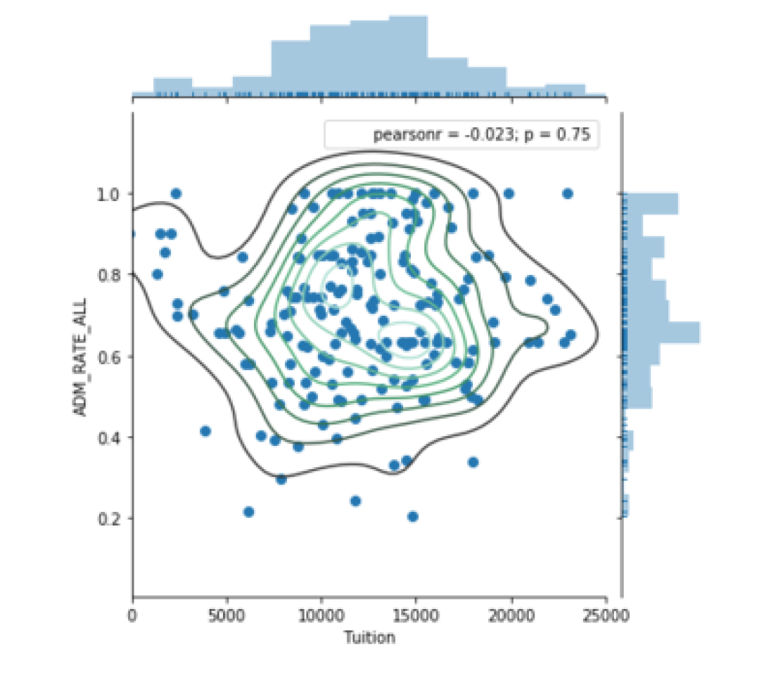
jointplot
更快捷的画Joint plot
边上自带displot
g = (sns.jointplot(x="Tuition", y="ADM_RATE_ALL", kind='scatter', # 指定kind
                    xlim=(0, 25000),
                    marginal_kws = dict(bins=15,rug=True),  			# 设定边上的displot的样式
                    data=df.query('UG < 2500 & Ownership == "Public"'))
            .plot_joint(sns.kdeplot))															# 在图内叠加kde
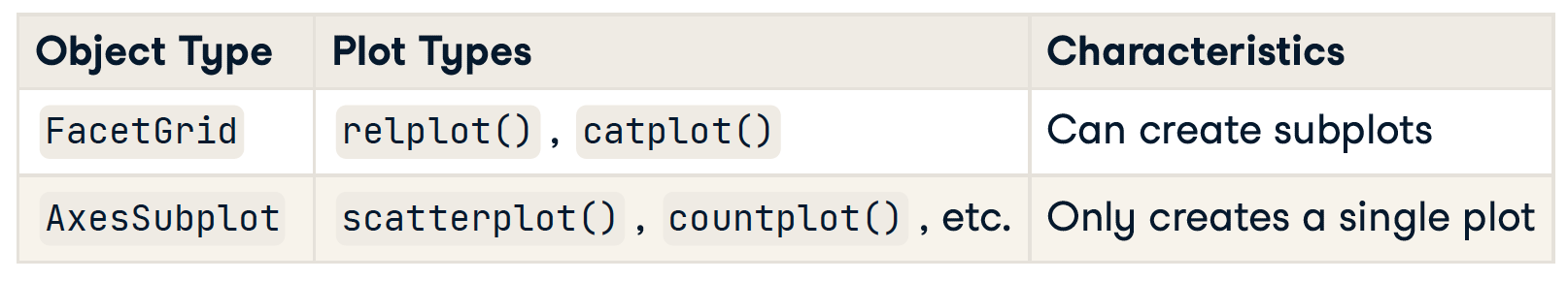
FacetGrid 与 AxesSubplot对象
Seaborn 的绘图函数创建两种不同类型的对象:FacetGrids 和 AxesSubplots。要确定您正在使用哪种类型的对象,首先将绘图输出分配给一个变量。
FacetGrid 由一个或多个 AxesSubplots 组成,这就是它支持子图的方式。
FacetGrid 添加标题
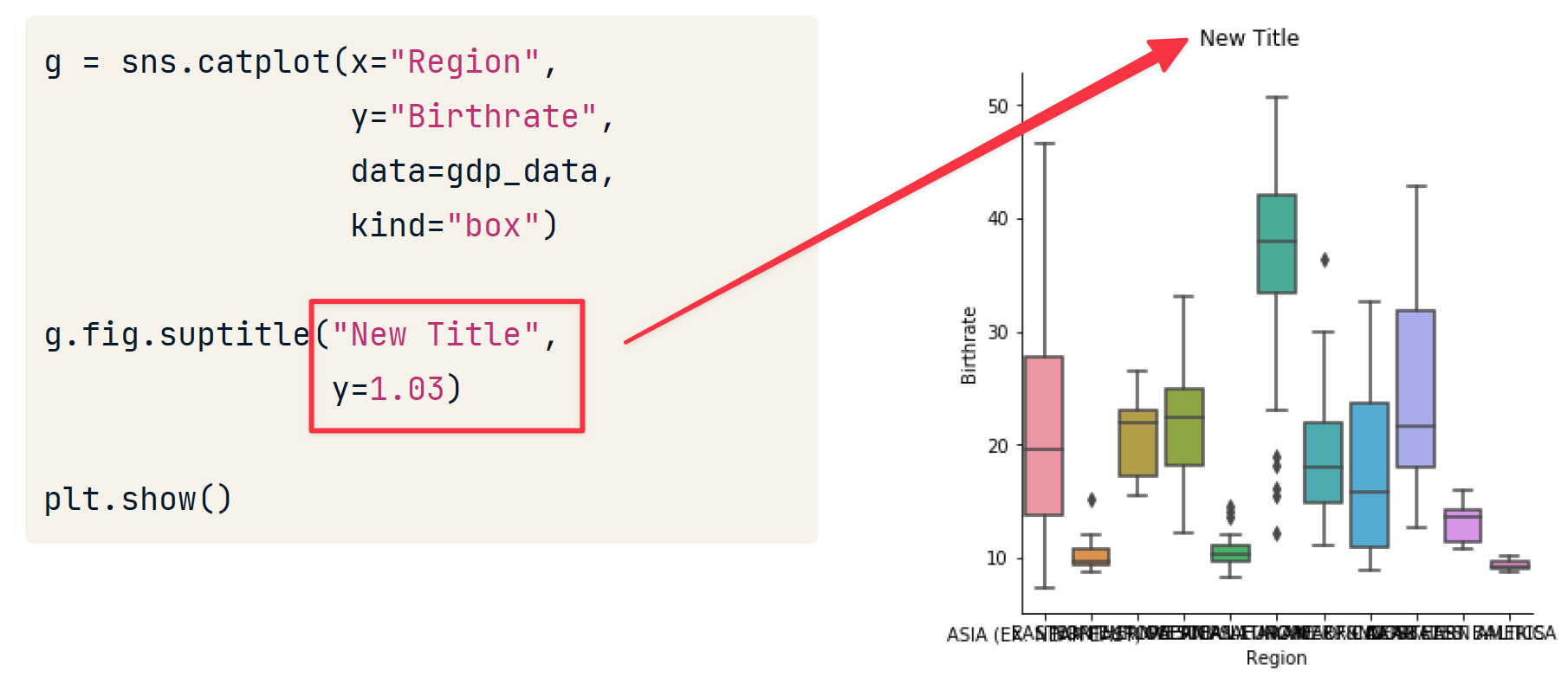
AxesSubplot 添加标题
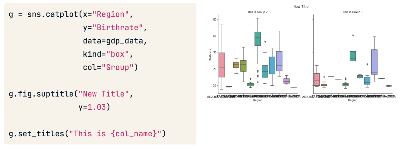
对于子图的标题,建议使用后期处理的方式添加。
Adding axis labels
g.set(xlabel="New X Label", ylabel="New Y Label")
Rotating x-axis tick labels
plt.xticks(rotation=90)
修改轴scale
# Plot the y-axis on a log scale
plt.yscale('log')
总结
- 查看分布用 displot
- displot将 rugplot(),kdeplot()和matplotlib的hist和三为一
- 回归分析 用 lmplot
- 检查数据的分布用lvplot等
- 需要按照属性对数据图进行对比,使用factorplot
- 最后,熟悉了数据,可以用pairplot 和 jointplot进行呈现