Visual Perception of Text
大约 8 分钟
Visual Perception of Text
Text
Reading text = visual pattern recognition
文本是一种具有编码意义的图像
- 感知到的视觉模式
- 使用语言的内部表述进行解码
- 使用句法、语义和语用学知识进行解释
图标并不总是最合适的,有时文字描述的效果更好。
- Syntactic: 语言结构,语法,例如。句子 名词短语 动词短语 或调试打印文本
- Semantic: 例如,单词和句子的(非)字面意思,不考虑上下文。
- 实用性「Pragmatic」:关于所涉及的个人和情况的背景的含义
Fixations: Perception and comprehension「理解力」 takes place only during fixations (in between is idle state)
Decoding and interpretation in design
- Lexical ambiguity in interfaces
- Semantic priming「启动」
- The use of context 「上下文的使用」
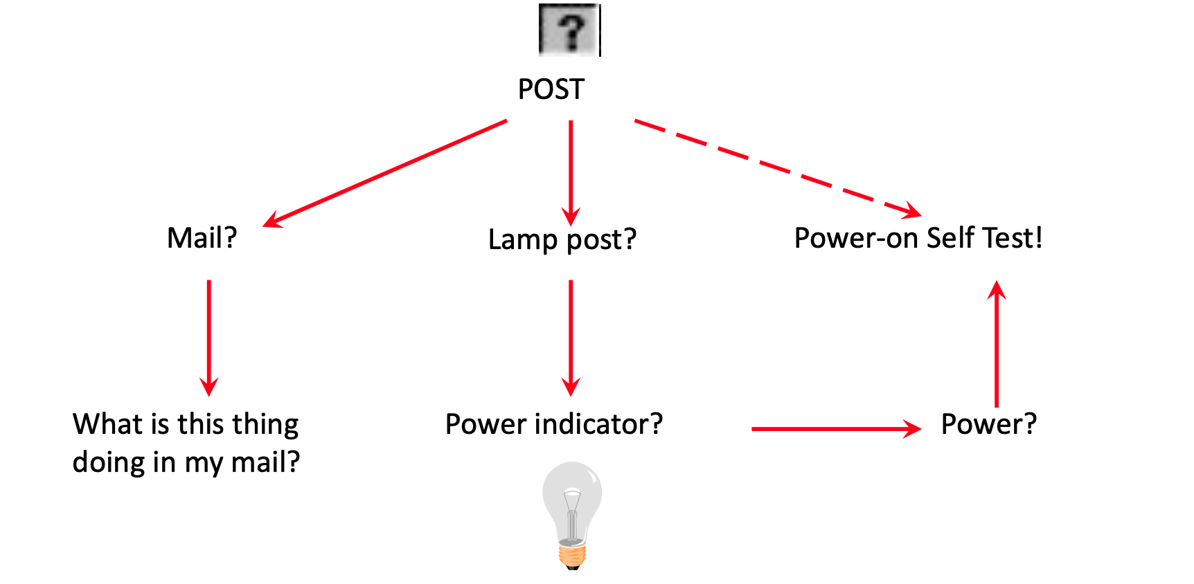
- 作为用户(新手),您知道的越少,您就越依赖上下文。
- 如果未提供上下文,则词典含义将变为活动状态。就像计算机一样,用户变得容易犯错——含糊不清。语义启动是解决方案。「Semantic priming is the solution.」
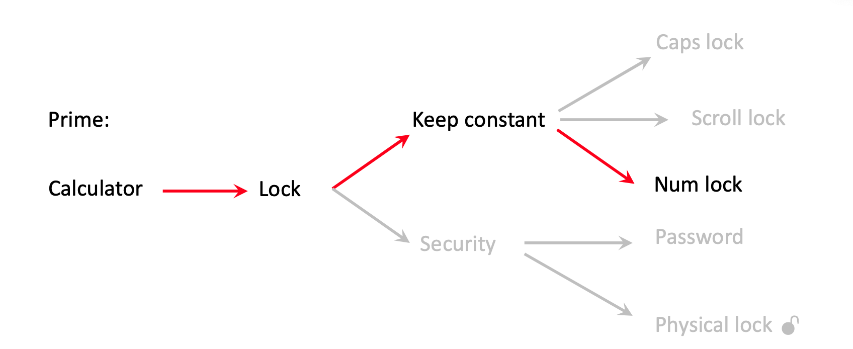
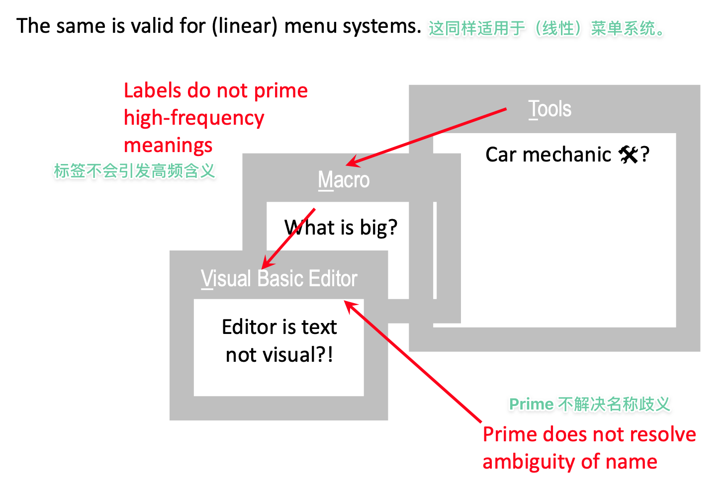
- Ambiguity: One word pointing at more meanings
- Synonyms: More words, pointing at one meaning
Random trial-and-error
Random trial-and-error is a low level problem solving strategy but commonly found with non-expert users「随机试错是一种低层次的问题解决策略,但常见于非专业用户。」
Remember: Mental models of designers and users clash
Recommendations
- Know your user groups (novices, experts, other than intended)
- 标签很短, 然而,要避免含糊不清
- 不要使用同义词
- 标签是自我阐释的
- 标签应该是高频含义的主要内容: (Start > Shut Down > Standby > OK???)
- 使用上下文线索(例如,文本处理器 的 联想与 电子表格 不同)。
不该做什么的例子...- 糟糕的对齐方式!
- 不流畅
- 对比度差
- 无法区分彩色标签和可编辑字段
- 重复性差
- 按钮看起来不像按钮!
- 结构不明确
- 块与排列竞争
Summary
- 文字是视觉输入的一种形式,对于引导用户浏览界面来说是最重要的(包括图标的标签),文字具有强烈的模糊性。
- 你应该提供能在语义上引导预期含义的元素。这就是上下文。"按'开始'来停止一个进程是在引导错误的语义关联
要制作一个GUI,要从以下方面着手:对比、重复、统一、靠近。网格是满足这些要求的好方法。
- 将图标和文字所代表的功能排列成系列,使用户可以将信息 "分块 "成有意义的单元,而不会被众多不相关的小工具所淹没(使用相似性和接近性)。
- 请记住,一幅图像所表达的内容胜过千言万语,但它所表达的内容我们不知道,因为文字比图像要精确得多(这就是为什么人类发明了语言)。